These pairings move from quiet sage and ivory to deep forest under gold, and the right one depends on whether your venue needs color or structure.
A blank ballroom needs color brought in, while wood beams or garden windows already do half the work.
Velvet runs higher than standard drape fabric, and forest green stock is spotty; warm bulbs keep it rich, but cool LEDs drain the depth until it looks like budget polyester.
1. Emerald Green & Gold
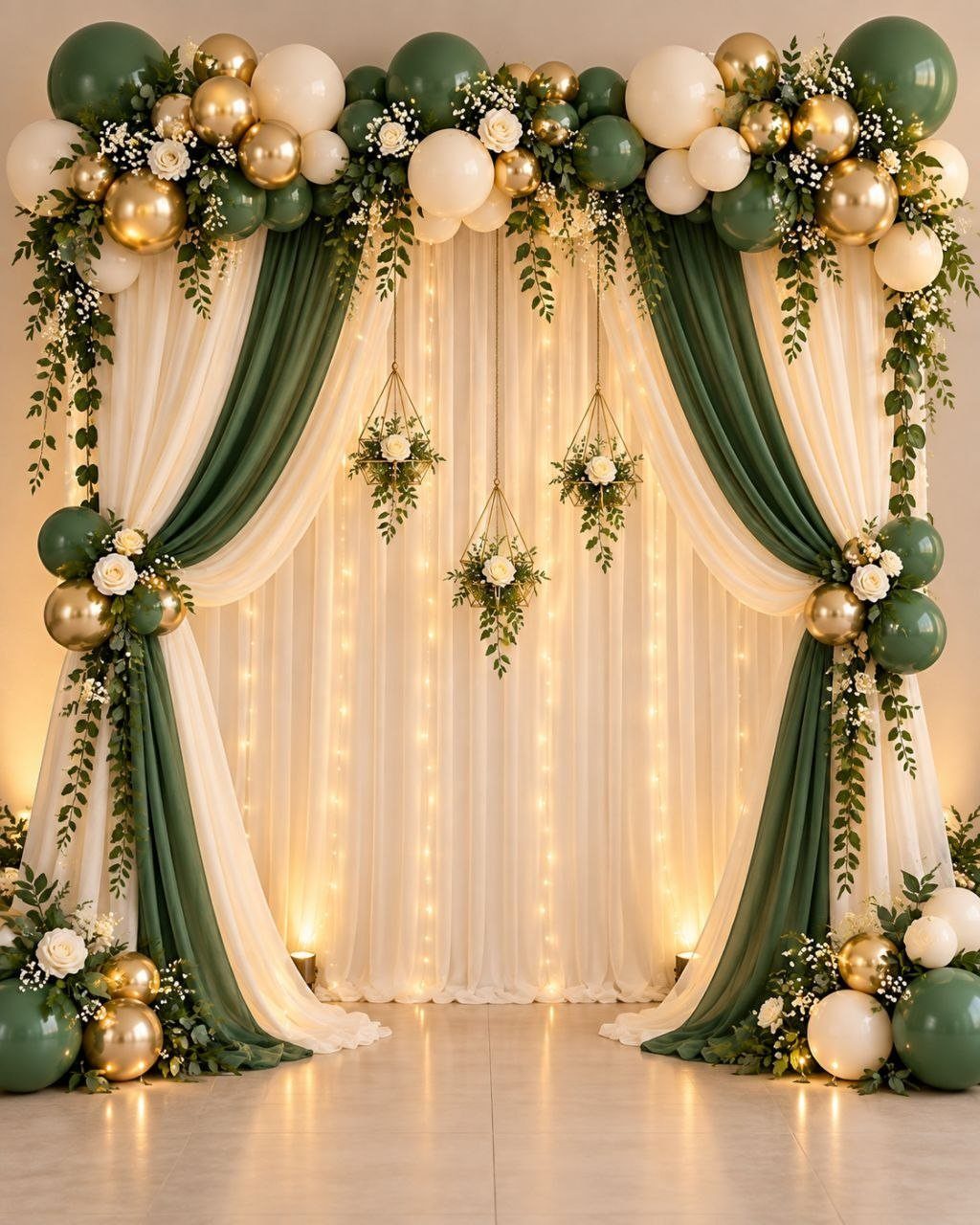
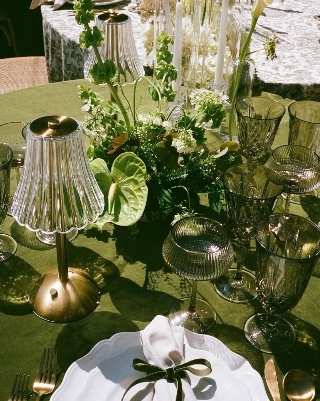
Emerald green and gold read as royalty without the ballroom price tag. Keep the green deep enough that it absorbs light rather than reflecting it back flat.
Velvet catches both colors best, though a heavy satin works if your venue runs warm.
Gold goes on cutlery, candlesticks, and the thin rim of a charger plate; emerald covers the larger surfaces so the eye travels to the metallic accents.
Winter ceremonies gain the most from this pairing, since the palette needs dim light to pool and glow. I’d skip it for a July afternoon unless your space has thick curtains.
2. Forest Green & Ivory
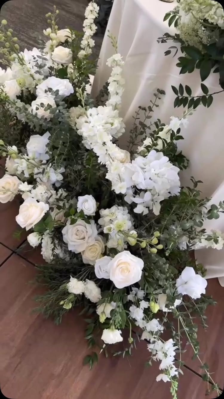
Ivory softens forest green into something you could use for a morning ceremony without the color feeling like evening wear. The combination leans traditional, which helps when one side of the family expected something more conventional than you planned.
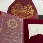
Gold enters as an accent, not a third color: a thin line on invitation borders, the stem of a wine glass, or a single charger at each place setting. Too much gold tips the balance toward holiday party territory.
White through cream florals let the foliage carry the green rather than competing with it. This is the palette I’d hand to a couple who disagreed on how formal the wedding should feel.
3. Sage Green & Soft Ivory
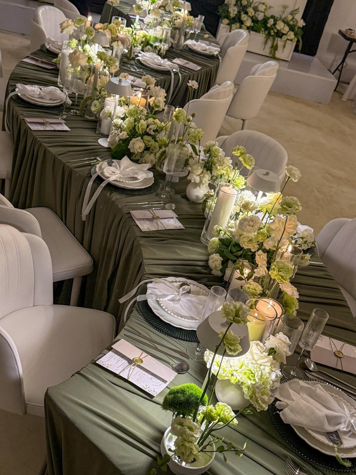
Sage green and soft ivory suit the couple who wants green in the room but flinches at anything that reads Christmas or camping.
The tone is quiet enough that you can use it across every surface without the space feeling themed.
Ivory linens with greenery runners keep the eye moving horizontally, which helps a long table feel intimate rather than institutional.
Spring and early summer dates get the most from this pairing, since the light is still soft and the outdoor options stay open. Eucalyptus works here in a way that would look sparse against a darker green.
4. Sage Green & Dusty Blue
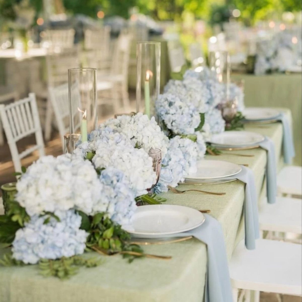
Dusty blue and sage green solve the problem of a color palette that feels finished without a neutral anchor.
Both colors carry enough gray to sit together without vibration, and neither one dominates in the way that navy or burgundy would against the same sage.
Blue napkins against a sage cloth, blue hydrangeas against green foliage: the balance is already there. Mixed bridesmaid dresses in both tones let you accommodate different complexions without splitting the party into two camps.
I’d use this for a garden or outdoor reception where the sky itself becomes part of the design.
The palette reads as intentional rather than matchy, which matters when your guests are mostly in their late 20s and have seen a lot of weddings.
5. Forest Green & Burgundy
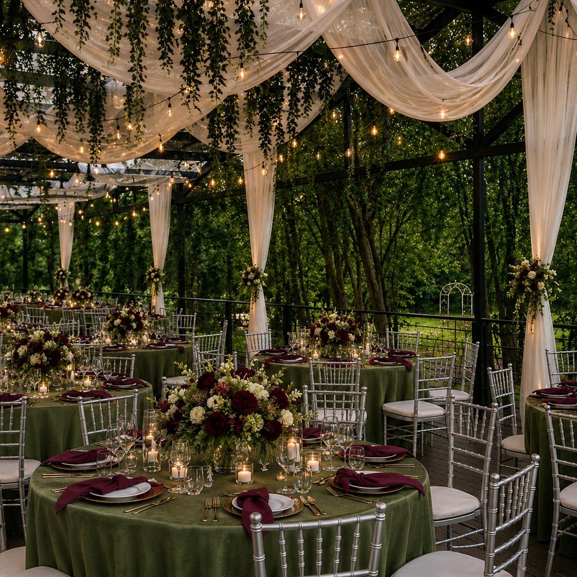
Forest green and burgundy trade the crispness of ivory for something that absorbs sound and candlelight equally well.
The result is a room that feels smaller and warmer than its square footage, which helps a rented pavilion or barn that might otherwise feel cavernous.
Put the green on tablecloths, the burgundy on napkins and in the florals; this keeps the darker red from pooling too heavily in any one place. White drapery overhead prevents the canopy from turning cave-like.
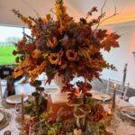
Autumn weddings gain the most, since the colors echo what is already happening outside and your floral budget can stretch toward late-season dahlias and roses.
Navy enters as a third color only if your groomsmen need a jacket color; otherwise, skip it and let the two tones carry the weight.
6. Forest Green & Navy
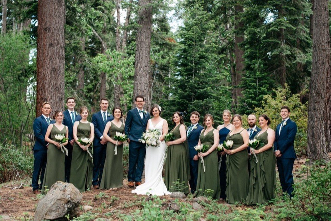
Navy and forest green together read as depth rather than contrast. The colors are close enough in value that photographs flatten them into a single dark mass unless you separate them with texture or a thin line of white.
For decor, this means forest green table linens with navy napkins read as muddy; reverse it, or use navy on the men and green in the florals where the shapes separate the colors.
The combination suits a modern wedding where the couple wants color without softness, and it photographs cleanly in a wooded setting where a lighter palette would compete with the background.
I’d avoid adding burgundy to this mix; two colors manage the job well enough.
7. Forest Green & Cream
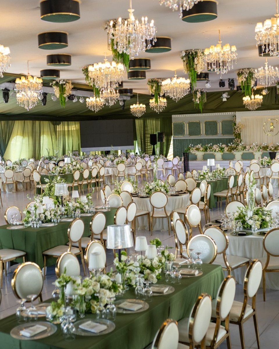
Forest green and cream gives you depth without the noise of a high-contrast palette. The cream keeps the green from reading too heavy, and the green keeps the cream from looking like a blank page.
I would start with the linens: forest green table runners or full cloths, cream napkins folded simple. For flowers, let cream blooms sit against dark greenery instead of bringing in competing colors.
The ceremony backdrop is where this pairing earns its keep: dark green fabric or living wall behind neutral draping.
This combination suits woodland or mountain venues where the outside color already leans dark. In a bright ballroom it can feel muddy; in a tent with filtered light, it grounds the space without gloom.
Fall weddings and smaller guest lists play to its strengths. It photographs quieter than bolder pairings; your photographer needs good light or the details flatten.
8. Forest Green and Gold
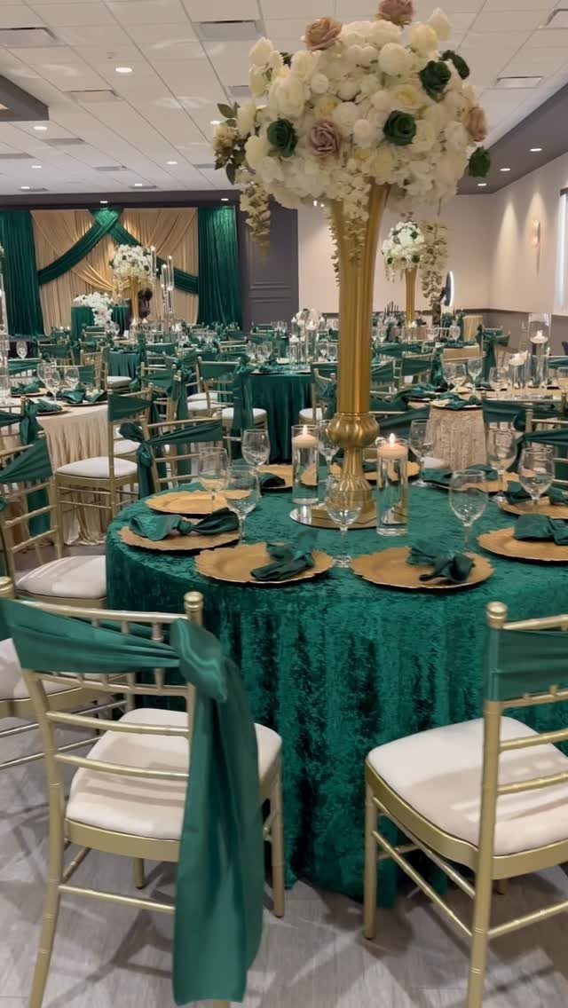
Crushed velvet in forest green under gold is the kind of pairing that announces itself before anyone sits down.
The texture matters as much as the color: a flat green cloth reads costume, but velvet catches light and throws it back in layers.
Gold chargers and flatware are the easy parts. The harder choice is how much gold before it gilds the lily.
One strong element wins over many small ones: either the chairs, or the centerpieces, or the chargers, not all three shouting. I would put the money into tall gold floral stands and keep the place settings simpler.
This runs formal by nature. A backyard tent wants a different green; a hotel ballroom or historic hall is where this belongs.
Winter and fall dates carry the weight better than spring, when lighter palettes feel right.
The risk is Christmas. Too much red in your flowers or too much pine in the greenery tips it seasonal.
Stick to white and cream blooms, maybe a blush if you must, and let the green and gold do their own work.
9. Forest Green Bridesmaid Dresses
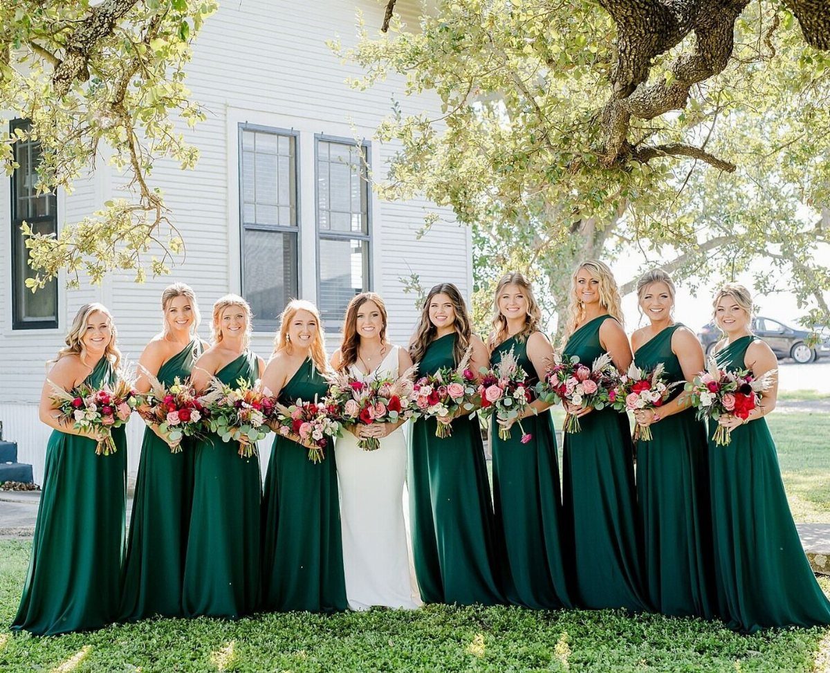
A full bridal party in matching forest green is a statement of confidence, and the confidence is warranted.
Green this deep flatters most skin tones better than brighter shades, and the consistency of one color across every dress gives a bridal party visual weight that scattered colors never achieve.
The matching does not have to mean identical. Chiffon, satin and velvet in the same dye lot read as texture, not mistake, but fabric swatches are non-negotiable.
The same named color in different materials can shift enough to look accidental, and accidental is not the look.
I’d add contrast in the bouquets: pink and red florals against the green, or white with berry tones. Without that warmth the group photograph goes dark in the middle.
For the bride, this framing makes white read brighter. Forest green demands real commitment from your friends; a color this saturated is not re-wearable for most occasions.
Choose it when your party is willing, and when the setting has enough light to show the color rather than swallow it.
10. Forest Green Velvet Reception Draping
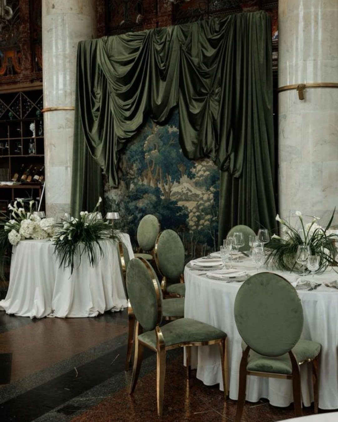
Floor-length velvet drapes in forest green turn a plain reception hall into a room with intention.
The weight of the fabric does the work: it absorbs sound, deepens color under chandeliers, and makes standard banquet chairs look like they were chosen.
The matching green velvet on chair frames is where this can tip into too much. I would do one or the other: drapes as architecture, or chairs as furniture, not both competing.
Without that negative space the room closes in.
Velvet rental costs more than standard drape fabric, and not every vendor carries it in forest green. The question is whether your venue needs that level of intervention.
A space with character of its own, wood paneling or garden views, fights heavy dressing. A neutral box of a ballroom, or a tent with white walls, is where this investment pays.
Check the lighting before you commit. Warm bulbs bring out the richness; cool LEDs flatten velvet to something cheaper than it is.
Choosing Complementary Colors
Gold pushes it toward formal; the metallic catches light and throws it back against the dark green in a way that reads expensive without needing much quantity.
Blush softens forest green for spring dates when burgundy would feel heavy. Navy keeps the palette dark but strips out the warmth, which suits couples who want color without romance.
Pick one companion color and stay with it; forest green with gold and blush and navy all in the same room fights itself.
Seasonal Considerations
Emerald and forest green need dim light to pool properly. Winter ceremonies get this naturally: short days, candlelight, overcast skies.
The color absorbs what light there is and glows back rather than flattening. Velvet and lace in these tones make sense for winter because the fabrics match the weight of the season.
Sage green wants the opposite. The lighter tone needs real light to read as green rather than gray, which makes spring and summer its natural home.
Pair it with pastels or crisp white and the palette stays airy; try the same sage in a December ballroom and it goes muddy. Your venue’s windows and your date’s sunset time matter as much as the color swatch.
Floral Arrangements
Green works in flowers as either the star or the supporting actor, which is rarer than it sounds. Most colors demand top billing.
Eucalyptus, fern, and pine needle grass carry color without competing for attention.
Either way, green connects the arrangement to whatever wood, stone, or landscape is already in the room.
Textures and Materials
The same named green in chiffon, satin, and velvet will read as three different colors under the same light. The dye absorbs differently, and the fabric’s surface reflects what hits it at its own angle.
This is not a flaw to hide; it is texture to use. Mix the fabrics intentionally across a bridal party and the group gains dimension that matching material never achieves.
Order swatches before you commit. The color shift between materials is predictable but not uniform; a forest green that deepens beautifully in velvet might go flat in chiffon.
For decor, velvet absorbs sound and light where satin throws both back. A room draped entirely in one fabric, even the right color, goes monotone.
Pair velvet drapes with simpler linens, or satin runners with matte greenery, and each material shows the other to advantage.