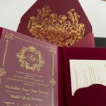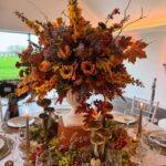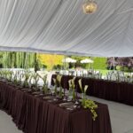
The combinations below run from navy and burgundy formality to a sage green and cream setup you can build with rented linens and grocery-store hydrangeas.
What settles the choice is your venue’s existing bones: a ballroom with chandeliers carries white and beige or emerald and gold, while a plain hall or outdoor lawn needs the color to come from the palette itself.
One of the cheaper pairings, mustard yellow and teal, still photographs well against greenery because the teal carries the weight in dresses or tablecloths while mustard stays small in pocket squares and floral accents.
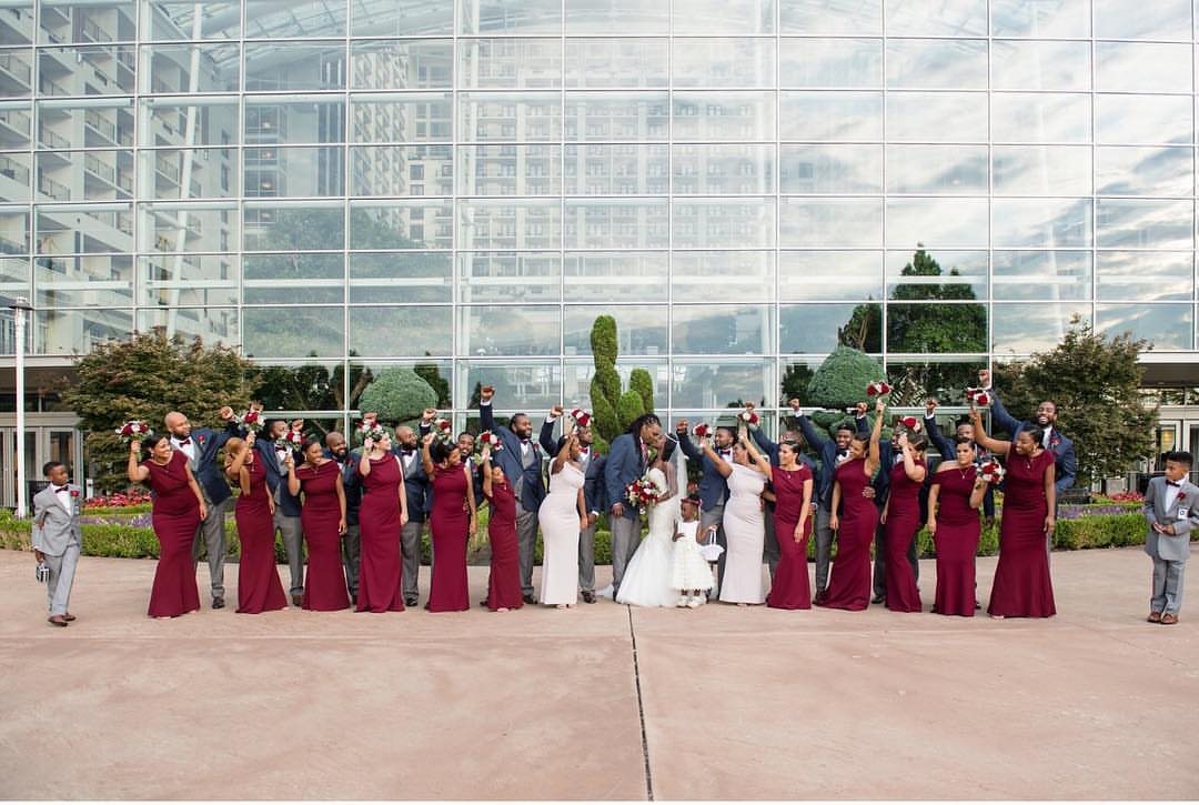
1. Navy and Burgundy
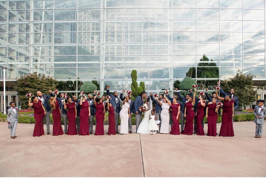
Navy and burgundy pair up into something that reads expensive without needing much cash. The groomsmen wear navy suits rather than black, which photographs richer in outdoor light and still reads as formal without the undertaker look.
Bridesmaids in burgundy work across seasons; the color shows up in department store formal stock year-round, so you are not hunting limited spring shades in October.
This palette demands evening or late afternoon timing. In bright midday sun the burgundy flattens toward brown and the navy can read as generic dark.
For a noon ceremony I would switch the burgundy to a brighter wine tone, or move the whole party indoors with window light behind them.
Winter and fall weddings get the most from this combination; summer couples should ask whether they want weighty colors in portraits taken outside.
2. Coral and Mint
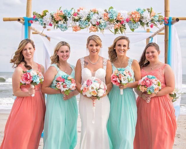
A beach wedding with coral and mint dresses on the bridesmaids keeps the color in the people rather than the scenery, which matters when the scenery is sand and rented chairs you cannot control.
The mint reads as neutral against tanned skin, so the coral carries the visual energy; swap which bridesmaid wears which shade depending on who tans and who burns.
For a garden wedding the same palette works with the mint in table runners and the coral in glassware or napkins.
Beach wind will flatten lightweight fabrics; choose crepe or a heavier chiffon for the dresses, or the mint reads as white in motion blur.
3. Lavender and Aqua
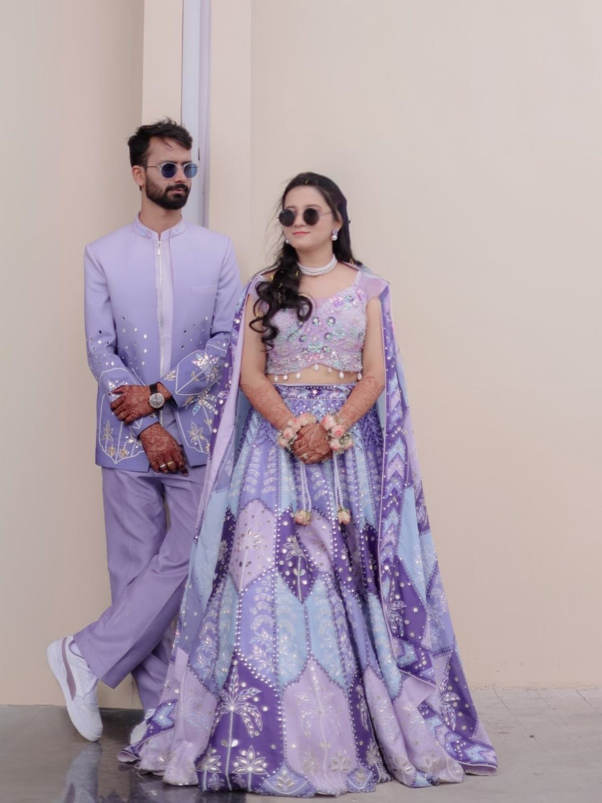
Lavender and aqua suit a couple who wants color without committing to a single dominant mood. The lavender leans feminine, the aqua pulls cool and modern, and together they cancel each other’s excess.
Both partners can wear lavender with aqua as accent, or reverse that so aqua becomes the larger field and lavender shows up in ties or jewelry; that second arrangement shifts the balance toward something more gender-neutral.
This palette lives or dies by saturation. Pale versions need strong light or they wash out to gray in evening photography.
Deeper lavender and truer aqua hold up indoors but can read as Easter-egg bright in full sun. Test your exact shades at the venue’s time of day, not in the bridal shop under fluorescent light.
For edible details, lavender cocktails and pistachio macarons extend the colors into the menu without adding rental items.
4. Pink and Blue
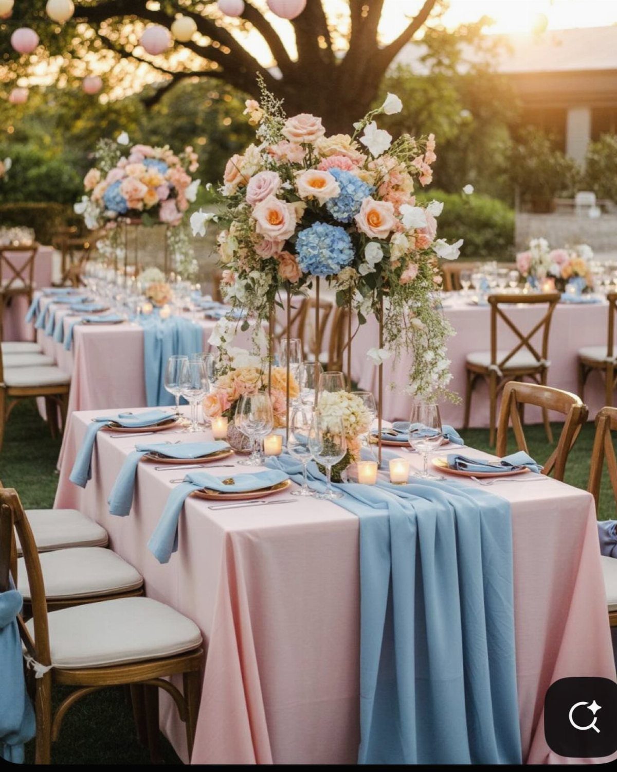
Pink and blue table settings work best when the pink carries the warmth and the blue supplies the structure.
Make pink the larger surface, the blue runner and napkins the smaller; that ratio keeps the table from reading as baby-shower pastel. Gold-rimmed plates add the necessary third temperature; without that warm metal the cool tones can feel flat.
Layering is the move here. One pink and one blue, used once each, looks accidental.
Repeat the colors in linens, flowers, and glassware so the eye reads intention rather than accident. For a bolder version, swap the light pink to berry and the dusty blue to navy; the same layout handles the saturation jump.
Outdoor receptions under tree cover, like this one, soften the colors naturally. In a hotel ballroom with artificial light, I would add more white or cream to rest the eye.
5. Lavender and Dark Green
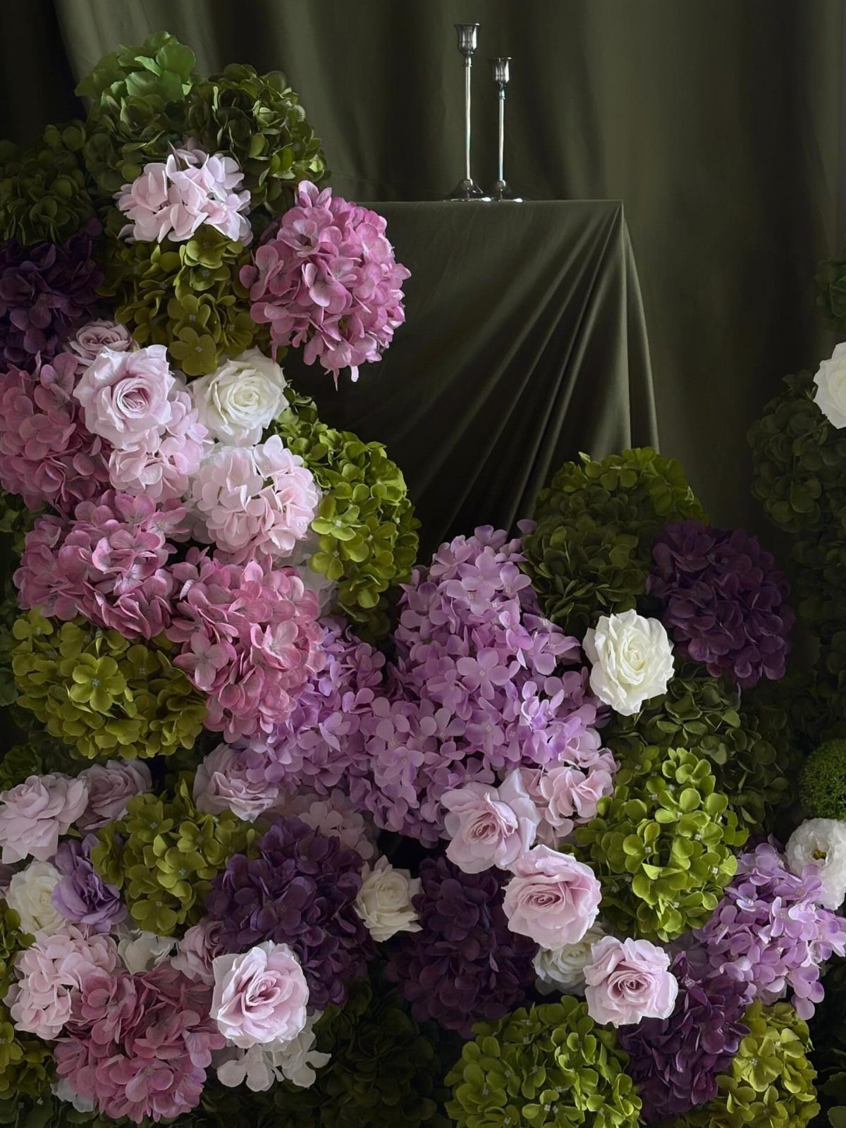
Lavender and dark green reverse the usual color hierarchy: the green becomes the backdrop and the lavender the accent, rather than the other way around.
Draped olive fabric absorbs light and lets the floral arrangement forward; without that dark field, the same flowers would scatter visually against a white or pale wall.
This combination suits venues that already have some natural texture: wood, stone, or aged plaster. In a modern glass space the green reads as decoration rather than setting, and the effect turns theatrical.
Silver candlesticks add a cool note that keeps the green from going muddy; brass or gold would warm the whole scene toward autumn.
For a groom, a dark green suit with lavender tie or pocket square carries the palette into attire without matching the bridesmaids. A lavender suit, reversed, works for a daytime wedding where the groom wants the bolder color claim.
6. Peach and Gold
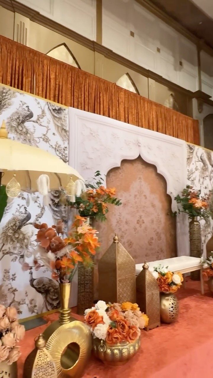
Peach and gold stage decor borrows from South Asian wedding traditions where the couple sits under a canopy rather than at a head table.
The gold here is metallic and reflective, not matte or printed; that shine does the work of movement in a still scene, catching light as guests shift position.
For a summer garden wedding, I would pull this palette down in scale: peach tablecloths, gold flatware, and single-stem peach flowers in small gold vases.
The stage’s peacock patterns and ceremonial umbrellas carry cultural weight that should not be borrowed as mere decoration. The warmth flatters candlelight and skin tones alike, so this palette extends naturally into evening without a lighting designer.
Peach reads as orange in some cameras and pink in others; check your photographer’s past work in similar rooms before committing.
7. Mustard Yellow and Teal
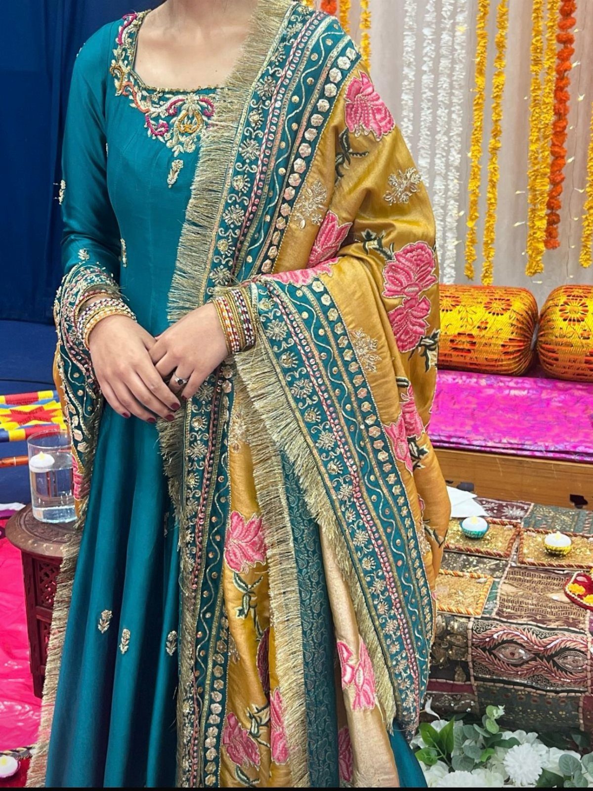
Mustard yellow and teal hit that sweet spot between unexpected and wearable. I like this pairing for summer weddings where the couple wants color that photographs well against greenery or ocean backdrops without defaulting to navy or blush.
The teal carries most of the weight in dresses, suits, or table linens; mustard works better as the accent in shawls, pocket squares, or floral arrangements. Too much mustard and the whole thing tips into sports-team territory.
This combo suits couples who want their wedding to feel joyful rather than formal.
It trades away some elegance for personality, which is the right call for outdoor venues, daytime celebrations, or any setting where guests should feel relaxed enough to dance early.
8. Emerald and Gold
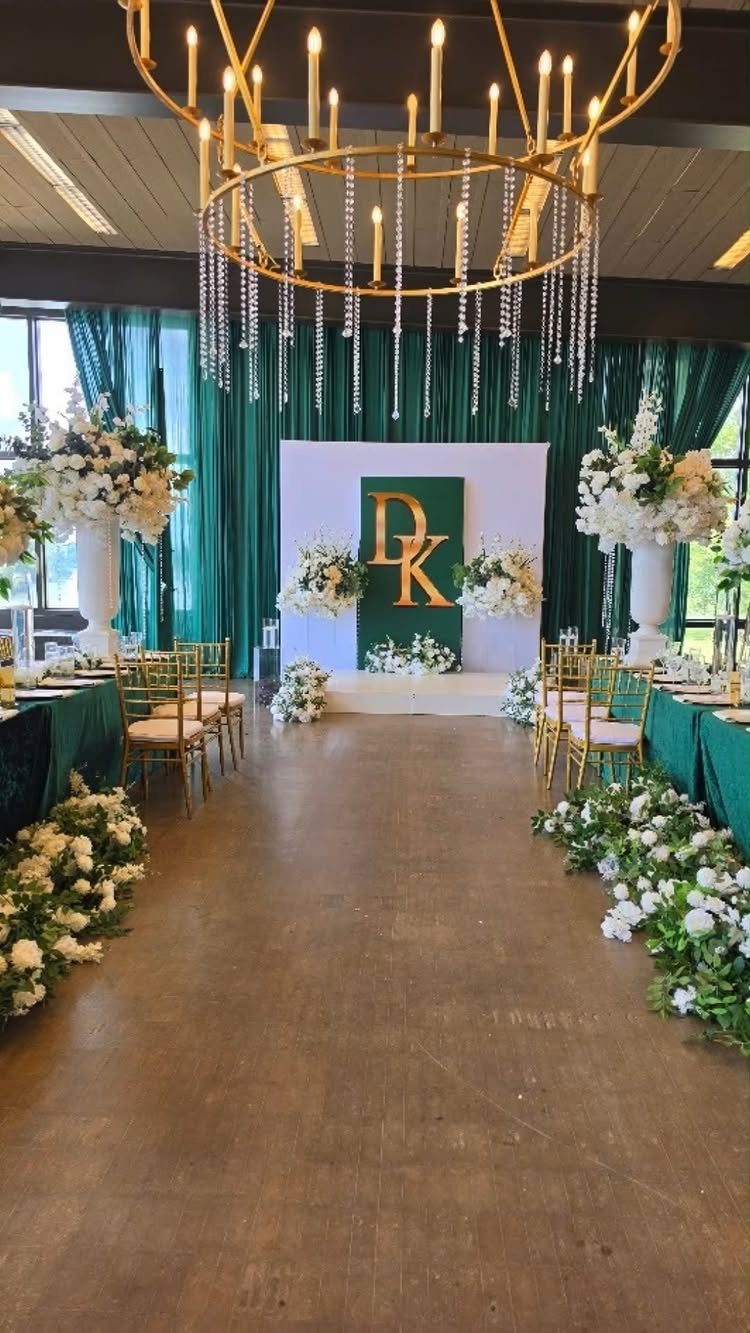
Emerald green with gold reads as expensive even when it isn’t. The green grounds the space while gold catches candlelight and camera flash in ways that read as intentional glamour.
I would keep the emerald to tablecloths, velvet ribbon on bouquets, or bridesmaid dresses in matte fabric; shiny emerald looks costume-y fast.
Gold lands well on chairs, flatware, charger plates, or a single oversized initial backdrop where it catches light without competing. Crystal or glass elements help the metallic read as refined rather than gaudy.
This palette demands a venue with some architecture already: high ceilings, existing chandeliers, or tall windows. In a plain rented hall without those bones, the colors can feel like they’re trying too hard.
Winter and early spring dates suit it best; in July the same choices feel heavy.
9. Burnt Orange and Olive Green
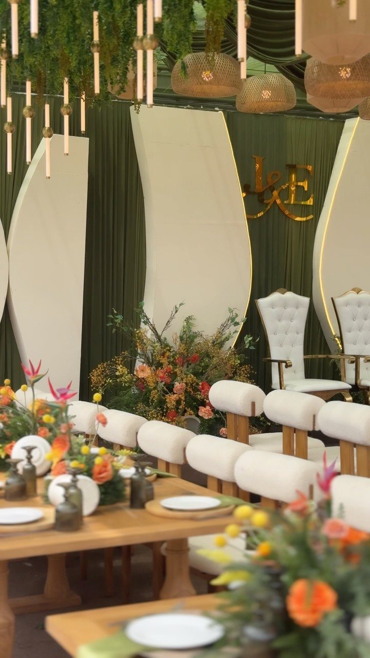
Burnt orange and olive green belong to fall, and fall only. The olive reads as neutral enough to use broadly; drape it on walls, use it in table runners, or put your wedding party in deep sage-adjacent tones.
Burnt orange should stay in flowers, candlelight, or small details where its warmth pops without overwhelming.
Wooden tables help this palette enormously. The natural grain bridges the two colors and keeps the whole thing from feeling like a craft project.
Dried textures in florals, pampas grass, or even seed heads extend the earthy quality.
This combination trades crispness for coziness. Skip it if your venue leans modern or industrial; the colors need softness around them.
10. Burgundy and Dusty Rose
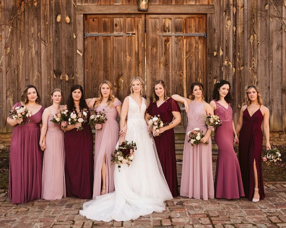
Burgundy and dusty rose solve the problem of a wedding party that wants mismatching dresses without looking accidental.
The two colors share enough DNA that a group photo reads as coordinated, but each bridesmaid can pick the shade that flatters her.
For decor, I would use burgundy as the dominant tone in table linens or florals, with dusty rose in napkins, menus, or candle glass. Reversing that ratio makes the whole thing feel too pastel; burgundy anchors it.
This palette works across seasons but shines in barn venues, vineyards, or anywhere with wood and soft light. The dusty rose specifically keeps burgundy from reading as Christmas or winter-only.
11. Black and White
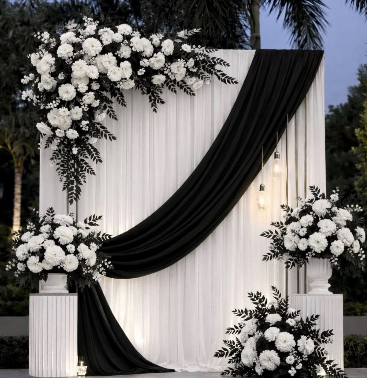
Black and white is the only palette on this list that gets harder, not easier, the more you add. Start with the assumption that everything is white: tablecloths, florals, candles, your cake.
Then add black in three places maximum. A black drape, some foliage, and thin structural lines do the work here; any more would tip toward funeral.
The modern touch comes from material choices. Matte black metal, glossy lacquer, or raw-edged linen each read differently.
I’d pick one black texture and repeat it.
This suits evening weddings, city venues, or couples who genuinely prefer clean lines to lushness. It trades warmth for impact, so consider whether your guests will feel comfortable in a space this edited.
Adding a single metallic, silver or gold, is the usual rescue; I’d add it in flatware or chair details rather than another large element.
12. Mocha and Champagne
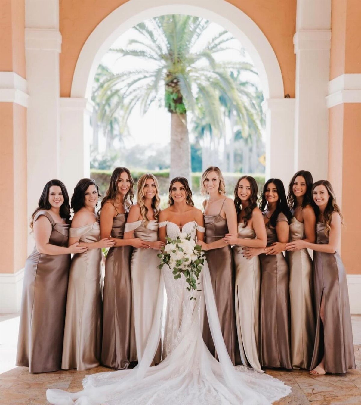
Mocha and champagne work because they are neighbors on the color wheel pretending to be a contrast. The result is monochromatic without the sterility of all-one-color dressing.
Satin or silk fabric is what makes this combination read as sophisticated rather than muddy. In matte cotton or linen, the same shades look like a mistake.
Long satin gowns carry this pairing; that sheen is doing significant work.
This palette suits outdoor weddings in warm climates, where the tones harmonize with skin in golden hour light.
It trades drama for ease; no one color fights for attention, which means your florals or your venue need to provide the interest.
I’d add texture in bouquets, maybe dried palms or pampas, so the eye has somewhere to rest besides the dresses.
13. Pink and Green
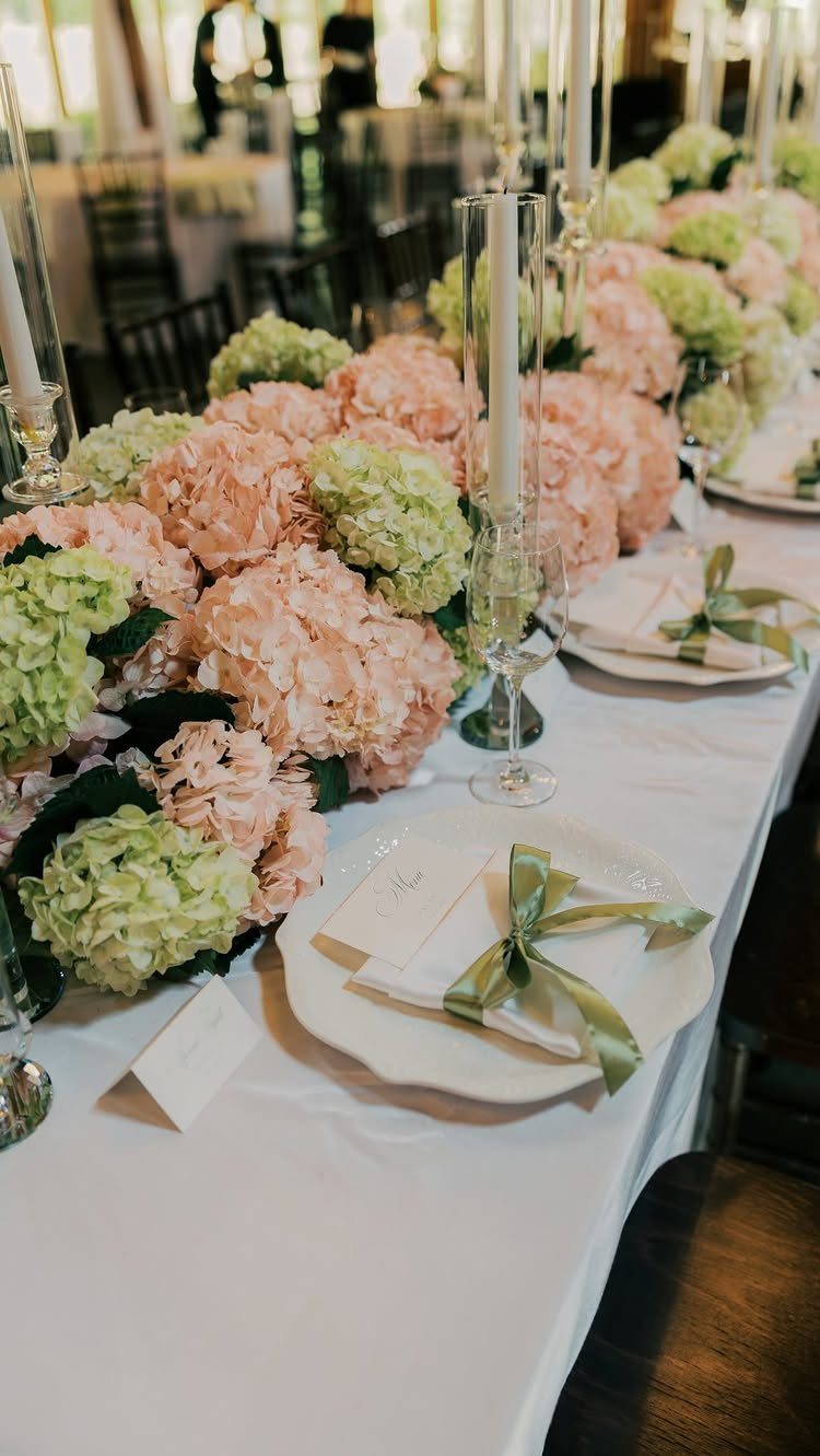
Pink and green reads as garden-party fresh without trying too hard for charm.
Hydrangeas in both colors give you the easiest floral runner; their full heads mean fewer stems to buy, and the green ones pass for foliage while still carrying the color.
Ribbon-wrapped napkins in a light green keep the palette moving down the table without centerpieces fighting for space.
Pink and green stay soft enough for a daytime ceremony but still register as color in photos, which is the balance most couples are after when they say they want something "not too much."
It works best from late spring through early fall, when real garden flowers are available and the outdoor light flatters softer tones. For a winter wedding, I’d swap to deeper rose and evergreen; the same idea, heavier fabric.
14. Sage Green and Cream
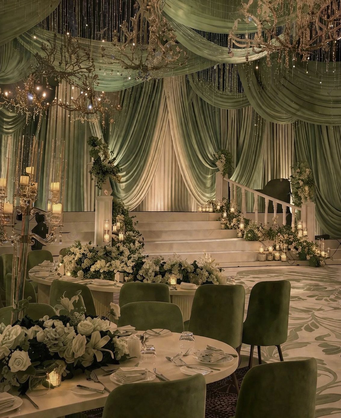
Sage green and cream drape well, and that matters more than you might think. Fabric backdrops in these two tones photograph as depth without shadow, and the velvet chairs add a texture that keeps the palette from going flat.
White florals sit between the two colors rather than competing.
The notes point to sage as soft and popular; I’d add that it reads as intentional, not as a color you settled for when emerald felt too bold. Cream rather than pure white warms the room under chandeliers.
This setup asks for a venue with existing architecture worth framing. In a plain hall, the draping becomes scenery you have to build from scratch, and the budget shifts fast.
15. Black, White, and Gold
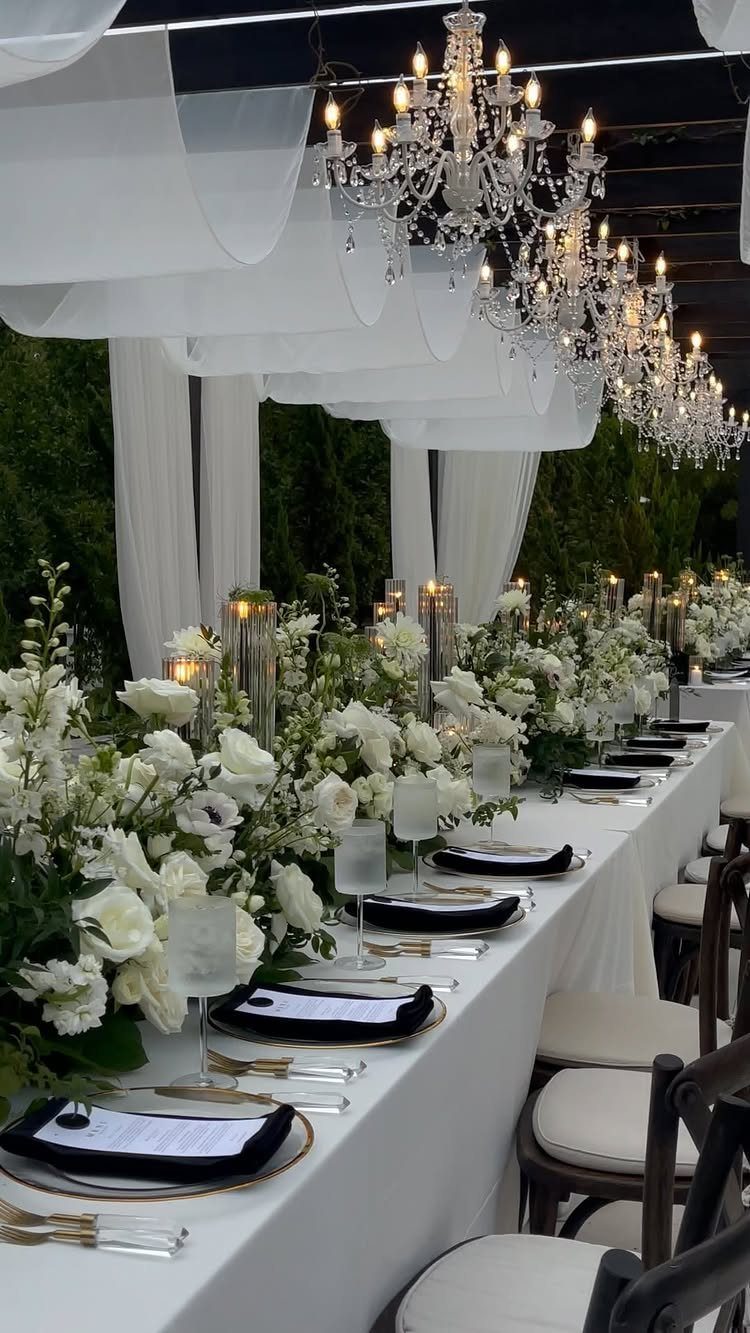
Black napkins on gold-rimmed plates give you the formal edge without a black tablecloth, which can swallow a lit table.
Crystal chandeliers do the work of adding sparkle; your job is keeping the rest restrained so they read as luxury, not clutter. White florals continue that discipline.
Gold cutlery is a rental cost that shows. If the budget is tight, I’d keep the gold to the plate rims and the flatware, skip gilded chargers or chair details.
This palette suits evening receptions where candlelight activates the metallics. For a daytime garden wedding, the black reads heavy and the gold gets lost in sun; choose something else.
16. Blush Pink and Cream
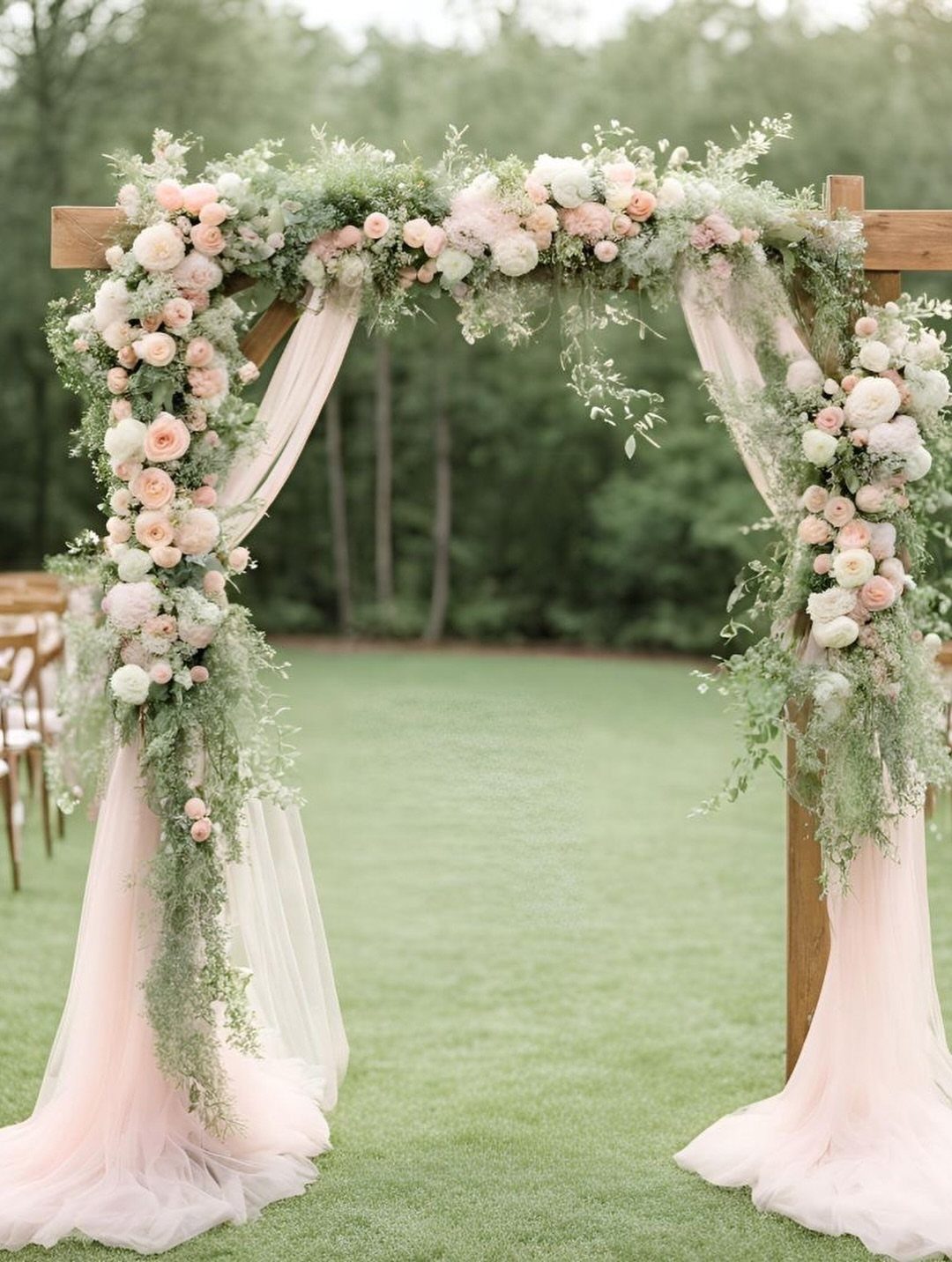
Blush pink and cream on an outdoor arch needs the greenery to hold it together.
Without the visible leaves and stems, the two pinks would blur into each other; with them, the arch reads as built from the garden rather than placed on it.
Sheer fabric drapes catch wind, so the weight of florals at the corners anchors the structure.
This is a ceremony palette more than a reception one. The softness flatters skin tones in photos where guests face the couple, and the colors don’t compete with white or ivory dresses.
For a reception, I’d add deeper tones or the room goes saccharine. A wooden arch helps; metal or painted white would push it toward baby-shower territory.
17. White and Beige Ballroom Decor
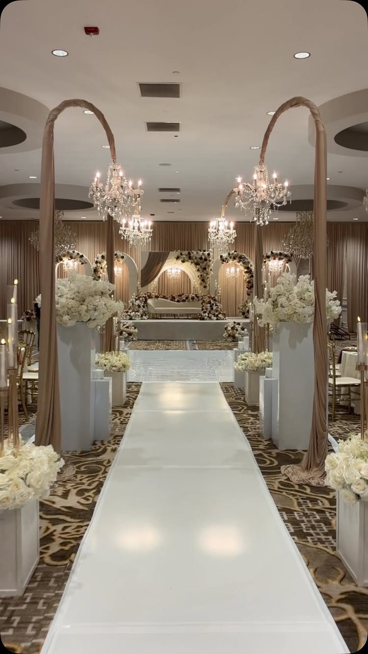
White and beige in a ballroom relies on scale to avoid reading as blank. The curved arches and hanging chandeliers in the visible setup give the eye architecture to travel through; without them, you’d be staring at tablecloths.
Floral pedestals at height draw attention forward to the stage, which is where the ceremony or the head table belongs.
This palette asks for a venue that already has the bones. Fabric draping, crystal rental, and custom stage builds add up fast; I’d estimate this look starts where modest wedding budgets end.
For a smaller room, the same colors work at lower stakes with linen table runners and single-height centerpieces. The calm stays; the grandeur goes.
18. Red and White Reception Decor
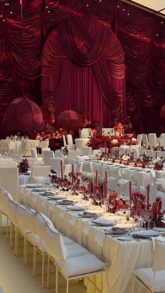
Red and white trades on contrast, and the visible setup pushes that hard: white everything except the florals, candles, and draped backdrop.
The deep red fabric arches behind the tables do more than decorate; they make the room feel smaller and more intimate than a bare hall of that size would read.
This is a winter or formal-evening choice. The red wants low light to glow rather than glare, and the white keeps it from going theatrical.
I’d be careful with the tone of red; the deep shade here avoids valentine associations, but a brighter red would. For a summer afternoon, the weight of draped fabric and dark color fights the season.
Choose coral and white instead, same structure, different temperature.
19. Terracotta and Dusty Rose
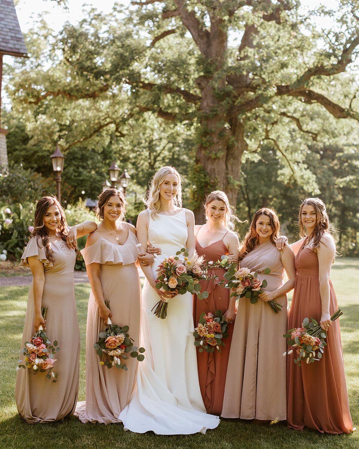
Terracotta and dusty rose give a bridal party warmth without matching too perfectly. A white dress pairs with bridesmaids in terracotta, mauve, and dusty rose floor-length gowns, and bouquets that carry the same range.
This palette suits late summer and early fall weddings, especially outdoors or in a vineyard setting. The earthy terracotta keeps dusty rose from reading too sweet, and the variation in shade lets each bridesmaid choose a tone that flatters her.
Natural linens and textured florals carry the same warmth through the rest of the decor. Copper or brass flatware would fit right in.
Skip this if you want crisp contrast; the slow fade from one color into the next is what makes the combination work.
20. Green, White, and Gold Tablescape
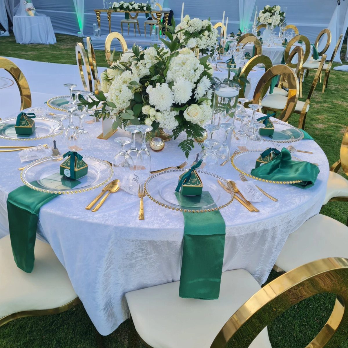
A white tablecloth with green napkins and gold cutlery reads formal without feeling rented.
Emerald green satin napkins, gold-rimmed clear charger plates, and small green gift boxes at each seat build the look, with white flowers and greenery running down the center.
Gold chairs pull the metallic through the whole scene instead of limiting it to the fork and knife. For a budget version, white or natural wood chairs work if you keep the chargers and the napkin fabric.
This setup needs a lawn or a tent with good light; indoors under dim hotel bulbs, the green can turn muddy. Check your venue’s lighting before you commit.
21. Pink and White Reception Decor
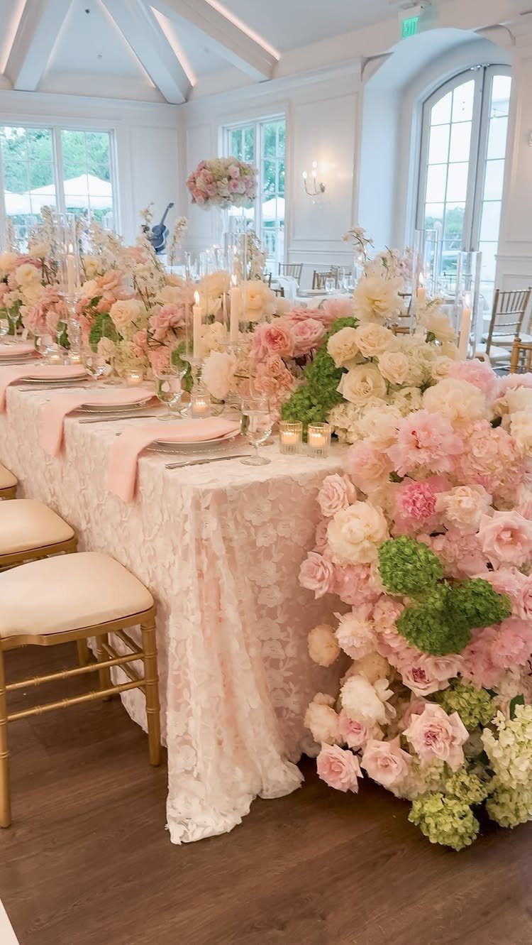
Pink and white reception decor lives or dies by the pink you choose. Pale, almost blush pink patterned lace linens set the base, with peonies and hydrangeas running the same range from deep pink buds to open white blooms.
White taper candles add height without introducing a third color.
The lace overlay is doing more work than the flowers here; it gives texture that plain pink cloth would lack.
If you rent linens, ask whether the lace is included or separate, and whether the pattern reads as vintage or busy from a few tables away.
This much pink and white needs a bright room. Large windows or strong overhead light keep it from turning saccharine.
In a dim space, add greenery or switch to a stronger pink that holds its own.
Choosing Colors by Season
Spring light is thin and cool, so pastels read as color rather than washed-out gray. Blush, lavender, mint, and soft yellow all gain presence against new green foliage that is not yet deep enough to swallow them.
Summer sun saturates everything. Orange, fuchsia, and teal hold their own against bright sky and tanned skin; softer shades disappear in the same light.
Fall’s low angle warms every tone. Rust, terracotta, olive, and burnt orange match the season rather than fighting it.
The same colors in June would look heavy and wrong.
Winter needs depth to register at all. Sapphire, burgundy, purple, and emerald create shape against flat gray sky or snow.
Without that saturation, decor disappears in photos taken at 4:30 PM.
Considering the Venue
A historic ballroom already has gold in its moldings and chandeliers. Rich jewel tones pick up that warmth rather than competing with it.
A garden venue offers green as a given; pastels or nature-inspired shades work with what is already there instead of layering another statement on top.
Look at the fixed elements you cannot change: wall color, carpet, permanent lighting. Your palette should complement those, not clash.
A bright outdoor space with uncontrolled light needs softer greens, pale pinks, airy blues. A formal ballroom with dimmed chandeliers can handle deeper tones, metallics, rich neutrals.
Your strongest color belongs where the eye lands: bridesmaid dresses, statement florals. Five colors give you enough room for depth and texture without the scattered look of too many competing tones.
Reflecting Personal Style
Your closet and your living room already contain your palette. The colors you wear repeatedly, the ones you chose for your sofa or your walls, are the ones that read as you.
A wedding palette built from those will feel like yours; one built from trends will feel like a costume you wore once.
Bold and modern couples can carry saturated, unexpected combinations. Classic and romantic pairs usually already know they gravitate toward soft, structured tones.
Neither is better; either fails when it is not true to who is standing at the altar.
Your wedding colors should capture and evoke the mood you want for your nuptials.
— Canva
Balancing Colors
Three to five colors is the workable range. One dominant tone carries the visual weight.
One or two secondary colors create relationship. One or two accents or metallics add the point of interest.
Below 3, the palette goes flat. Above 5, it fragments.
Mix light, medium, and dark within those choices. A palette of all mid-tones reads as mud; a palette with no dark lacks shadow and depth.
A bold main color needs neutral support, not another bold color competing for attention.
A tan or gray suit with color in the tie carries this principle into attire. The neutral does the quiet work; the accent does the memorable work.
The same ratio applies to tables, flowers, and paper goods.