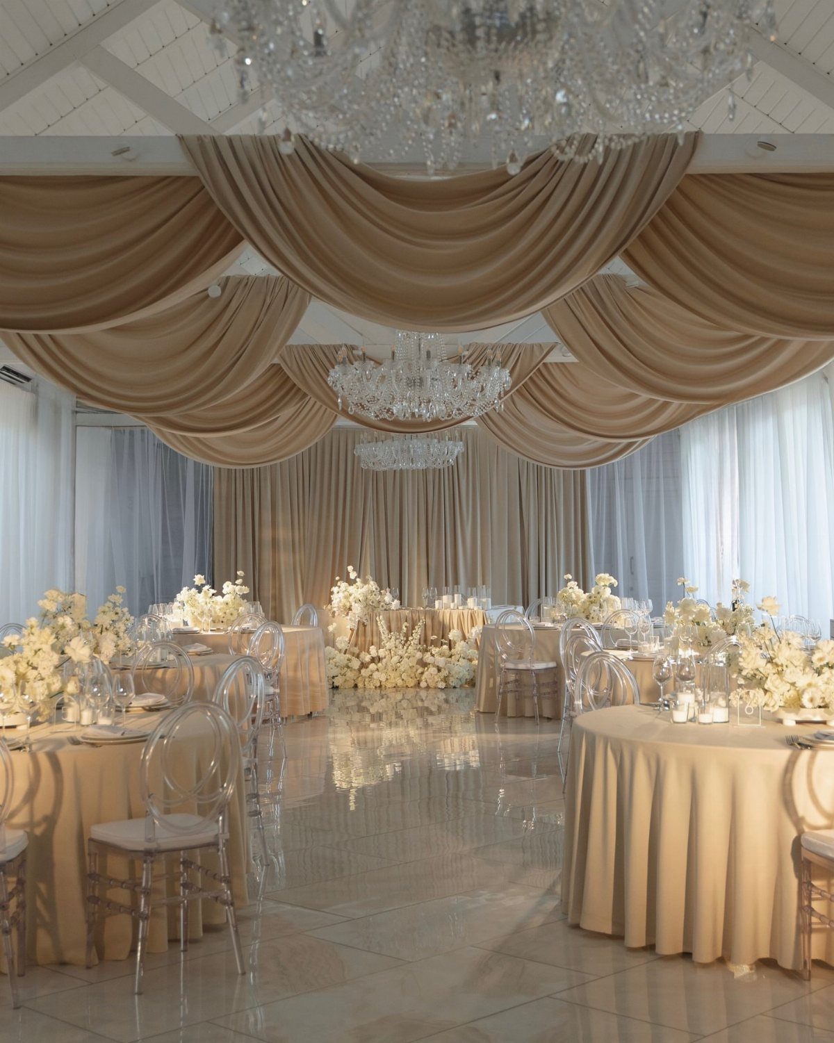
A reception palette can run from single-tone neutrals like champagne draped across linens and ceiling to bold installations pairing emerald velvet with magenta fabric and overhead florals.
The choice depends on your venue’s existing architecture and how much color you want concentrated in one place versus spread across surfaces.
Sage and dusty blue work best where you already have trees or grass doing half the job, while black linens ask for a formal indoor venue where the drama has space to land.
Terracotta pieces feel right in garden settings, and navy gives you the formality of black without requiring quite as much square footage to pull it off.
1. Sage Garden Elegance
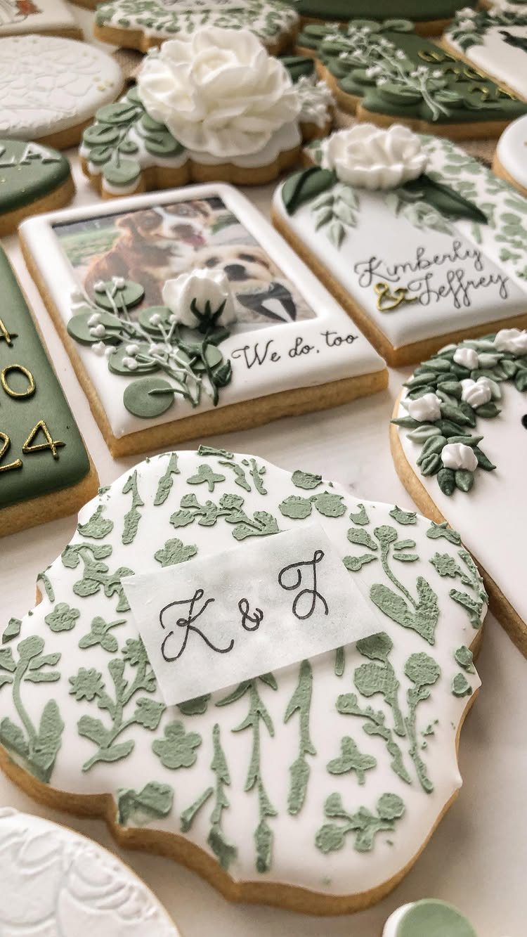
Sage green anchors this palette with a natural, garden-inspired feel that photographs soft but stays distinct. Sage icing and white details work for cookies, but the same palette carries into table linens, napkins, or bridesmaid dresses just as easily.
Sage sits next to cream, ivory, or pale blush for warmth, or with dusty blue for something cooler. It suits outdoor venues and spring or summer receptions without reading overly seasonal.
If your venue leans modern or industrial, sage brings in organic contrast. For a barn or garden space, it fits right in.
2. Soft Champagne Glow
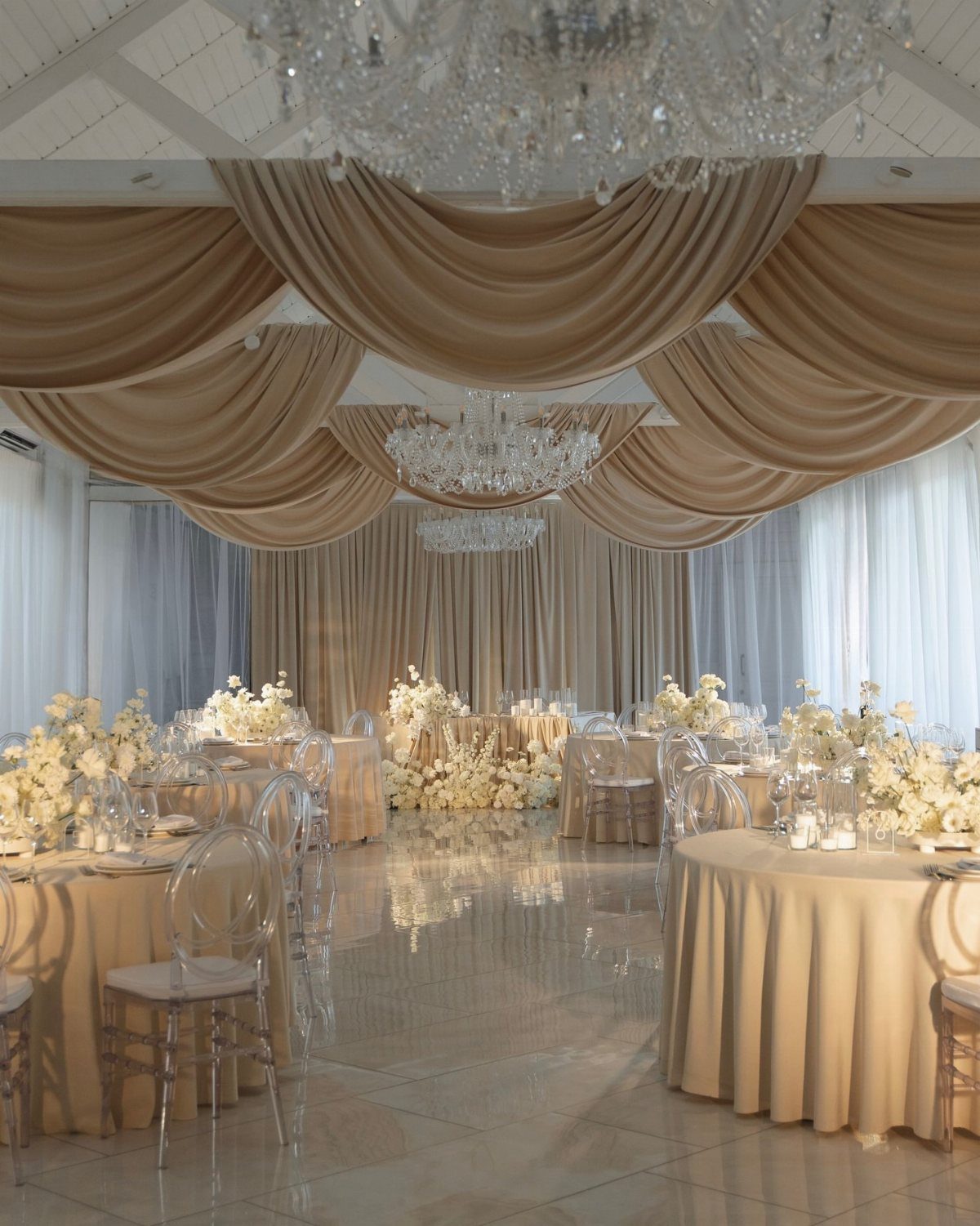
Champagne gives you warmth without strong color, so it works in spaces where you want texture and shimmer to do the visual work. Draped ceiling and tablecloths in one tone fill a room when the material catches light.
This palette suits receptions where the architecture or lighting is already interesting. Champagne linens, soft peach florals, and metallic accents layer without competing.
It photographs warm in most light, which helps if your reception runs into evening. Pair it with ivory, blush, or gold, and keep florals in pale peach or cream so the whole look stays cohesive.
3. Lavender Dream
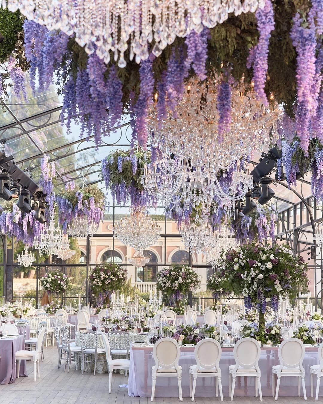
Lavender reads romantic and works well in outdoor settings where you want color that feels intentional but not heavy. Wisteria and chandeliers lean formal, but lavender shows up through simpler means: table runners, napkins, or a few floral arrangements.
Silver accents keep it from feeling too sweet. Lavender suits spring and early summer receptions, and it pairs with white, cream, or soft grey.
If your venue has natural greenery, lavender adds contrast without clashing. It also works indoors when you want a softer alternative to jewel tones.
4. Black-Tie Reception Colors
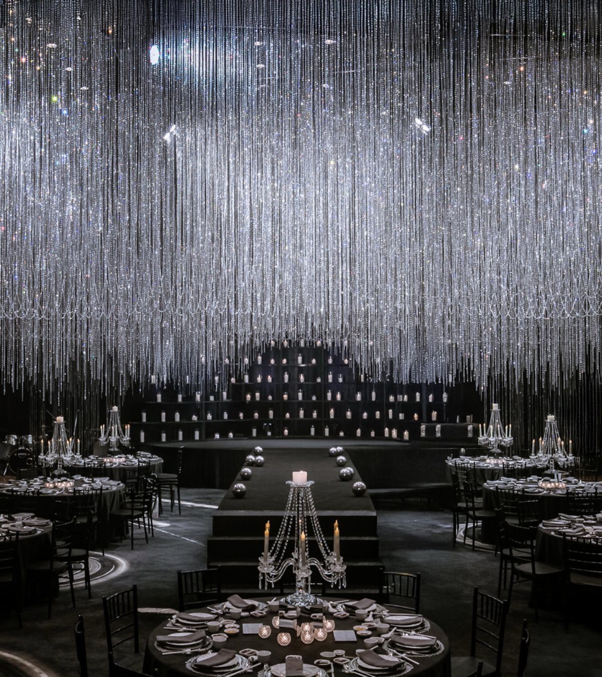
Black and silver suit a formal reception where you want high contrast and a polished look. Texture and finish matter as much as color when you are working with neutrals.
This palette works in ballrooms, hotels, or any venue where the architecture supports a sleek, modern aesthetic.
It photographs with strong definition, which helps in dim lighting. Pair it with white florals or metallic details, and skip pastels entirely so the contrast stays sharp.
5. Burgundy Glow
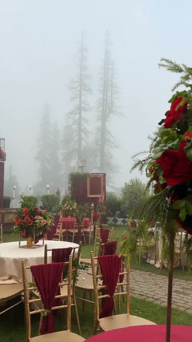
Burgundy brings depth and richness, and it suits fall or winter receptions where you want warmth without leaning into bright red.
Gold chairs and burgundy sashes read formal, but you could scale this down with burgundy napkins, florals, or centerpiece accents.
Gold or champagne metallics keep it from reading too dark. Burgundy sits next to cream, ivory, or blush to lighten it, or with deep green for a jewel-tone palette.
It works in barns, gardens, or ballrooms. If your venue has wood tones, burgundy complements them.
6. Navy and Champagne
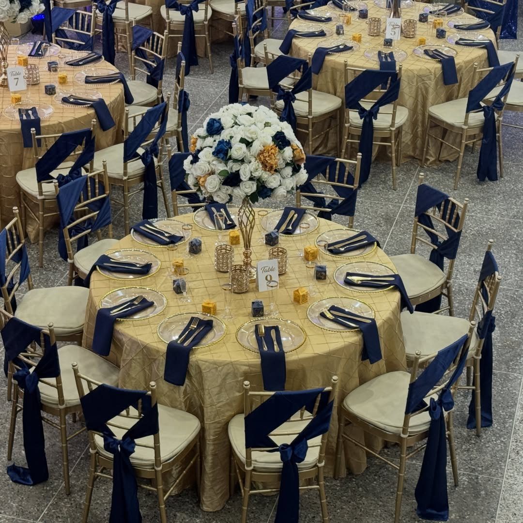
Navy and champagne suit a wide range of venues and seasons, which makes this one of the more adaptable formal palettes. Navy sashes and champagne linens work in hotel ballrooms, country clubs, or historic venues.
Navy stays formal without reading as stark as black, and champagne adds warmth without introducing strong color. Gold chargers, white florals, and navy napkins or table runners carry the look through.
It photographs well in most lighting, and it suits receptions where you want a traditional feel without pastels.
7. Terracotta Garden
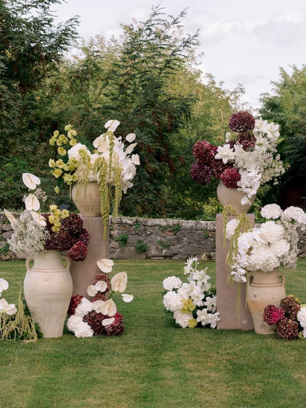
Terracotta brings warmth and texture to an outdoor reception, and it works best when the color stays in the containers rather than spread across every surface.
Large terracotta vases on pedestals anchor the space, and white or cream florals keep the look clean.
Pair terracotta with deep burgundy or soft blush for contrast.
This palette suits garden venues where natural elements already ground the design. If you are renting vases, terracotta finishes vary from smooth modern pots to aged, textured pieces, so check what the rental company stocks before committing.
Green foliage and wood tones tie the palette together without adding more color.
8. Burnt Orange Sunset
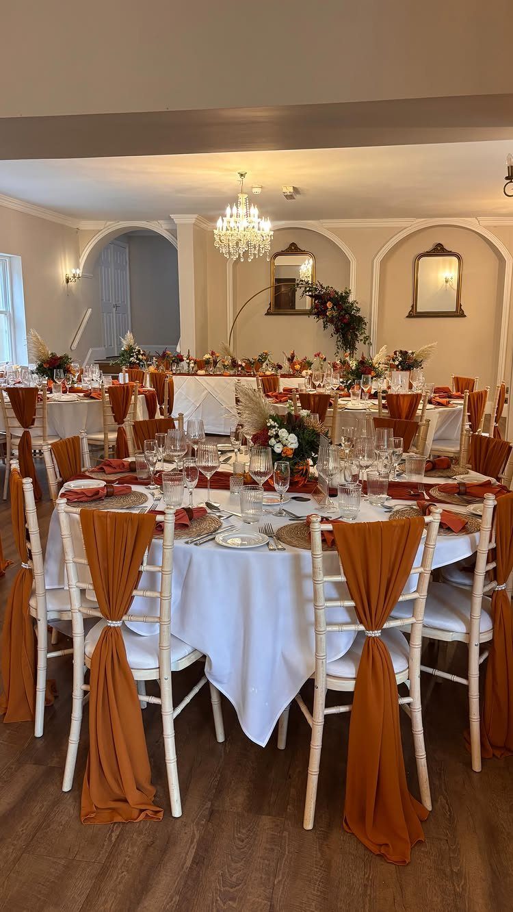
Burnt orange reads warm without tilting into bright red, which makes it a solid choice for fall receptions. Chair sashes and napkins in burnt orange layer easily with white linens, and the contrast stays visible in low light.
This palette suits ballrooms, barns, or hotel spaces where you want color but need the setup to stay simple. Burnt orange pairs with cream, gold, or deep burgundy.
Florals in peach, rust, or cream carry the palette through centerpieces without overwhelming the tables.
9. Soft Blue Classic
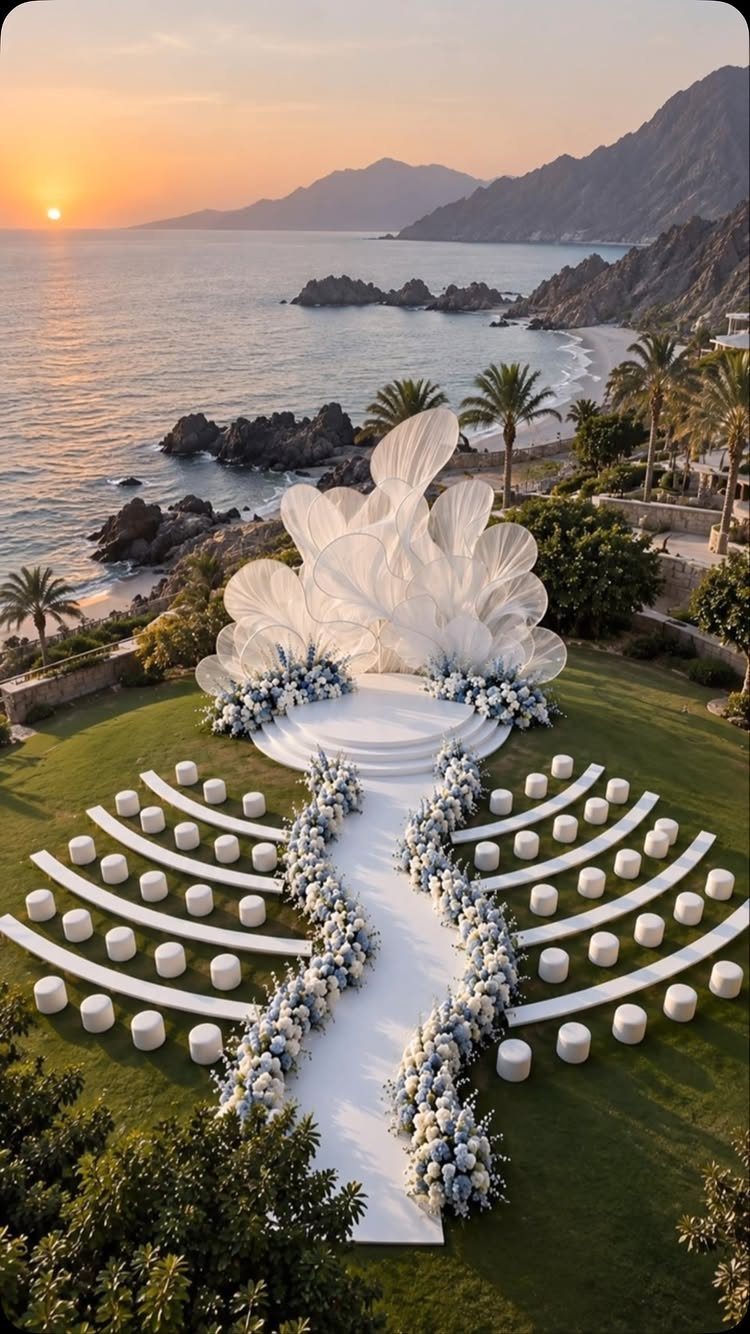
White seating and blue floral arrangements give you a clean, balanced look that photographs well in natural light.
This palette works outdoors and in spaces with high ceilings or open views. Pair soft blue with white, cream, or pale grey.
For a more formal setup, layer in silver or crystal accents. For something lighter, stick to white florals and blue linens or ribbons.
10. Sage and Blue Air
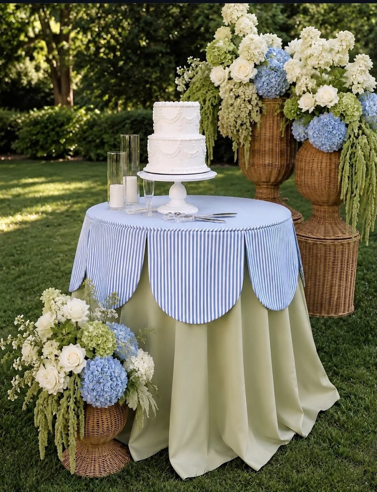
Sage and dusty blue together feel cool and refined without reading too casual. A striped overlay and sage tablecloth give you layered texture without adding pattern to every surface, which keeps the look grounded.
I reach for this combination in late spring through early summer, when outdoor venues make the most sense. Pair it with white or cream florals, and keep metals soft: brass or matte gold instead of bright silver.
If your venue has a lot of greenery, sage ties the indoor setup to the outdoor space.
11. Blush and Gold Glow
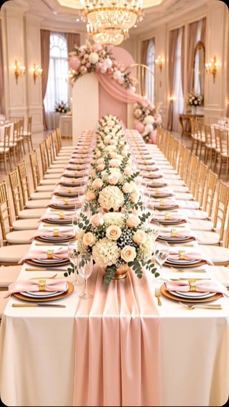
Blush and gold work in formal spaces where you want romance without pastels taking over. A blush runner with white and blush florals gives you soft color, and gold chairs add structure and warmth.
This palette suits ballrooms, estates, or venues with high ceilings and chandeliers.
Pair it with ivory linens, gold chargers, and white candles. If your venue has neutral walls or wood floors, blush and gold add warmth without clashing.
Keep the blush tones consistent across linens, florals, and any bridesmaid dresses so the look stays cohesive.
12. Soft Pink Sage
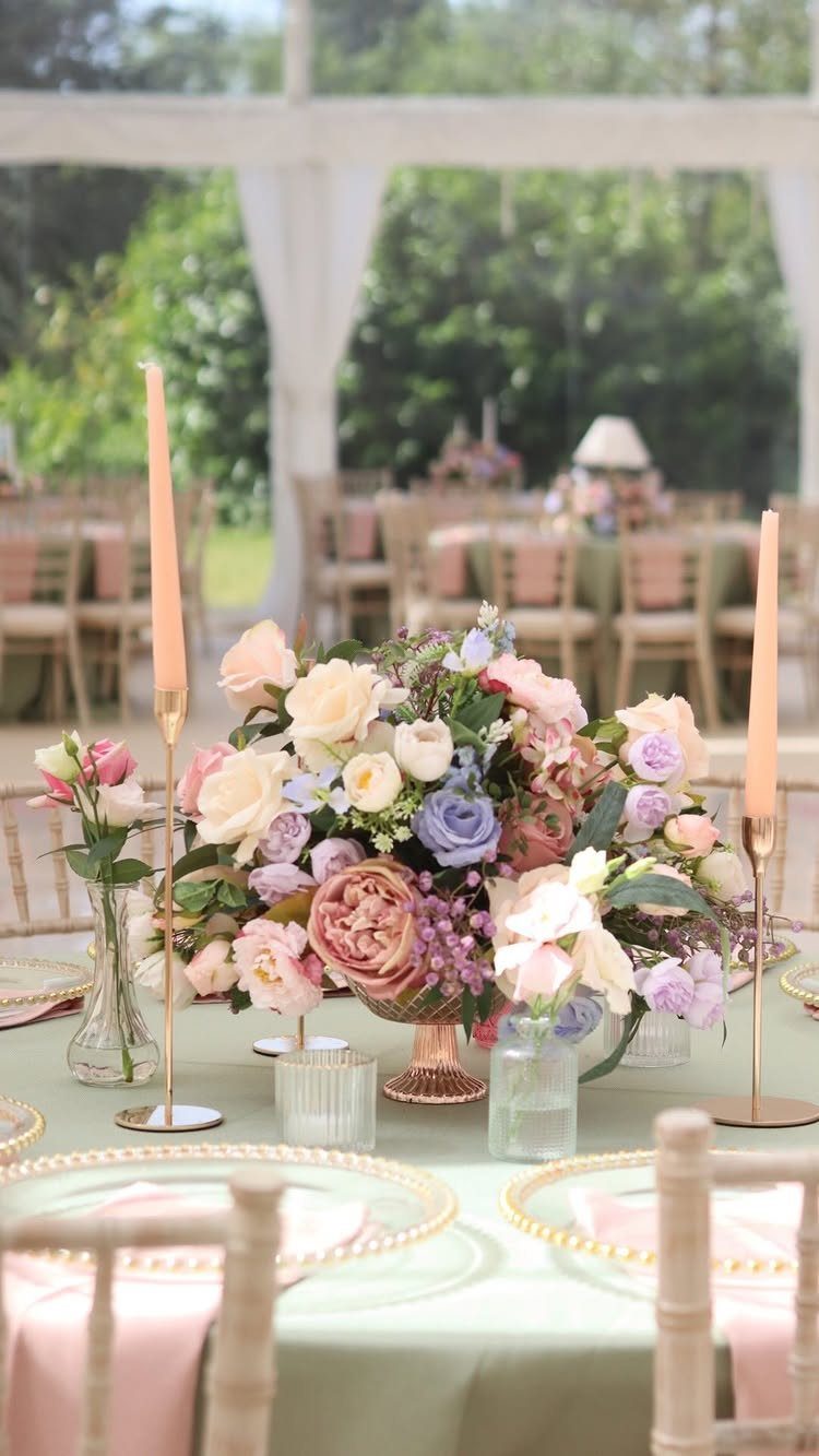
Pink and sage together give you a soft, garden-inspired palette that works indoors or out. A sage tablecloth with pink napkins and florals feels balanced without too much contrast, and the color stays visible in most lighting.
This palette suits tented receptions, barns, or venues with natural wood or greenery.
If your venue has a lot of white or neutral surfaces, pink and sage bring in color without overwhelming the space. Keep florals in soft pink, cream, and green so the whole setup reads cohesive.
Most importantly, the colors you choose must tie in with your wedding narrative. Although weddings are a predominantly white affair, it’s the accompanying colors that give shape to your theme and sets the mood (opens in a new tab or window) for your event.
— Canva
13. Black Champagne
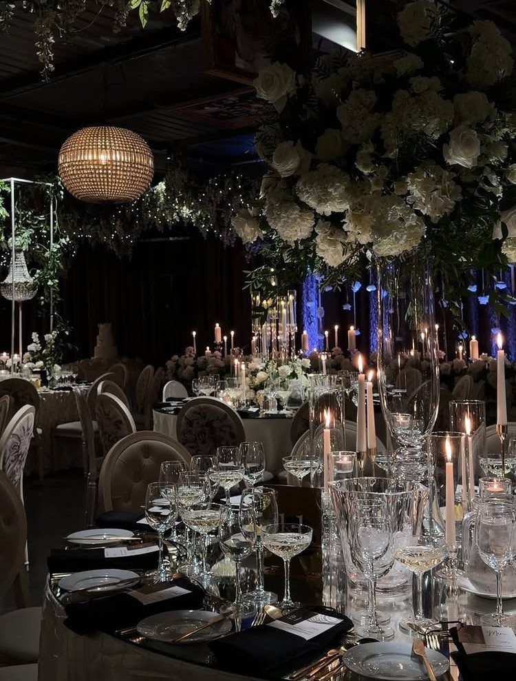
Black linens with champagne chairs give you drama without the starkness of an all-black setup. The champagne brings warmth, and the black keeps the contrast formal.
Black and champagne gold look best in ballrooms or hotel spaces with enough room for the contrast to register. Pair it with white florals, crystal glassware, and candles so the table has light and texture.
If your venue has low lighting, the champagne chairs and white florals keep the setup from disappearing into shadow.
14. Powder Blue Light
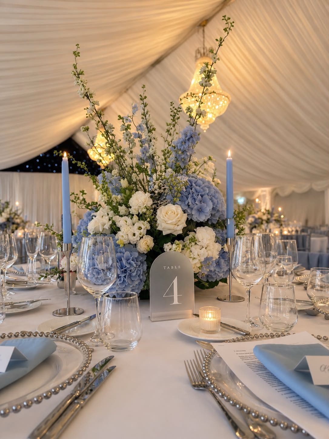
Powder blue napkins and candles layer easily with white linens, and the color stays soft without fading into the background. Blue hydrangeas or similar florals carry the palette through the centerpieces.
Powder blue shows up cleanly in tented receptions or venues with white walls.
More color means adding a second shade of blue in deeper tones. Less means keeping the powder blue in napkins and a few candles and letting the florals stay white.
15. Coral Peach
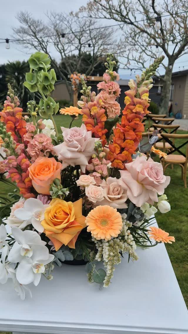
Coral and peach with butter yellow bring energy without reading too bright. The yellow lifts the palette, and the coral keeps it grounded.
This suits spring or summer receptions, especially outdoor venues where the color can sit against greenery. Pair it with white linens and white florals like orchids or roses to balance the brighter tones.
If your venue leans modern, this palette adds warmth. For a garden setting, it feels right at home.
16. Dusty Blue Yellow
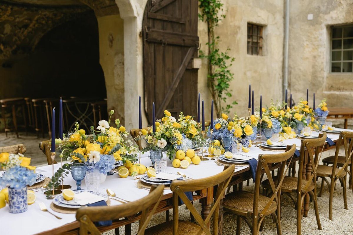
Dusty blue and butter yellow together feel unexpected but balanced. The yellow adds brightness, and the blue keeps it from tilting too warm.
Lemons or citrus as table accents carry the yellow through without adding more flowers.
Dusty blue and yellow suit outdoor receptions in late spring or summer.
17. Lavender Peach
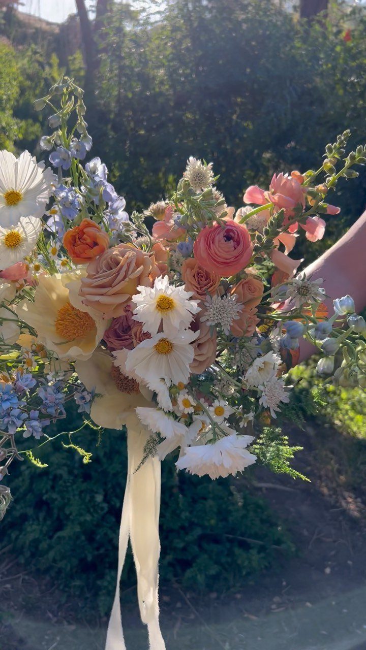
Lavender and peach sit next to each other without competing, and the combination reads fresh without leaning too sweet. Peach roses with lavender wildflowers give you soft color and texture in a bouquet or centerpiece.
More contrast means adding deeper purple. Lighter means sticking to pale peach and keeping the lavender sparse.
18. Periwinkle Ivory
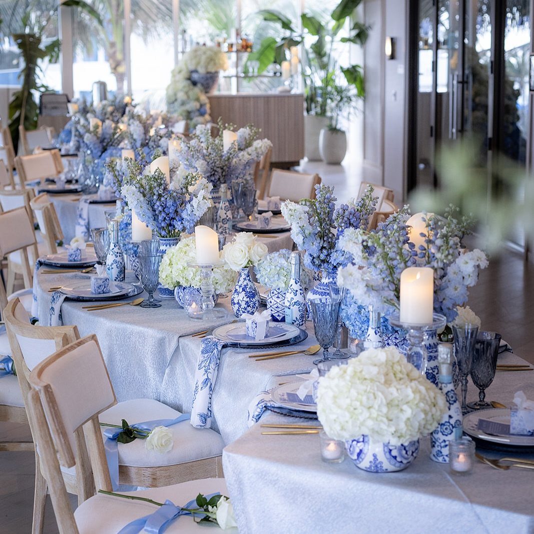
Periwinkle and ivory give you a pale, refined palette that works in formal spaces without reading too stark. Periwinkle florals and ribbons on white chairs add color without overwhelming the setup.
More depth means layering in navy or deeper blue accents.
19. Blue Sea Mist
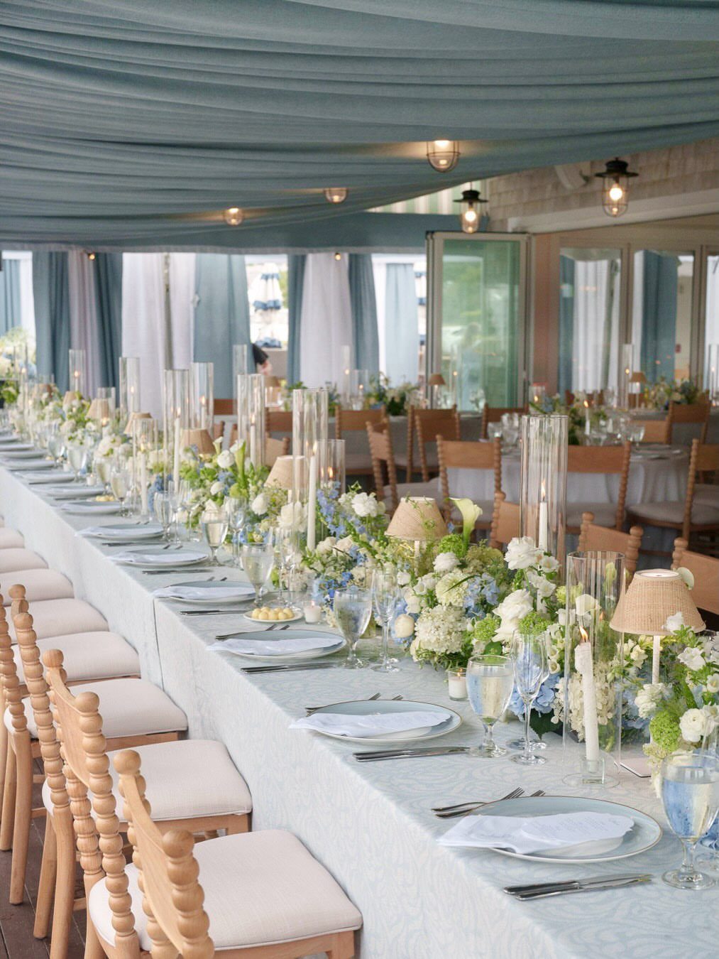
Blue and sea-inspired neutrals give you a coastal palette that feels calm and grounded. Light blue linens and white florals work outdoors or in tented receptions where the color can sit against sky or water.
Blue canopy fabric overhead carries the palette up without adding pattern to the tables.
If your venue has natural light or open views, this palette stays visible and lets the space show.
20. Pale Blue Silver
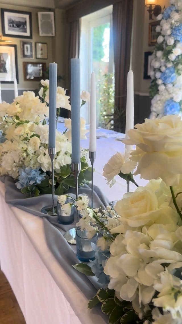
Pale blue with silver gives you a polished look that stays light. Blue taper candles in silver holders add height and color without taking up table space, and a silver runner brings texture without blocking the place settings.
This palette suits indoor receptions where you want coolness without jewel tones.
21. Latte Champagne
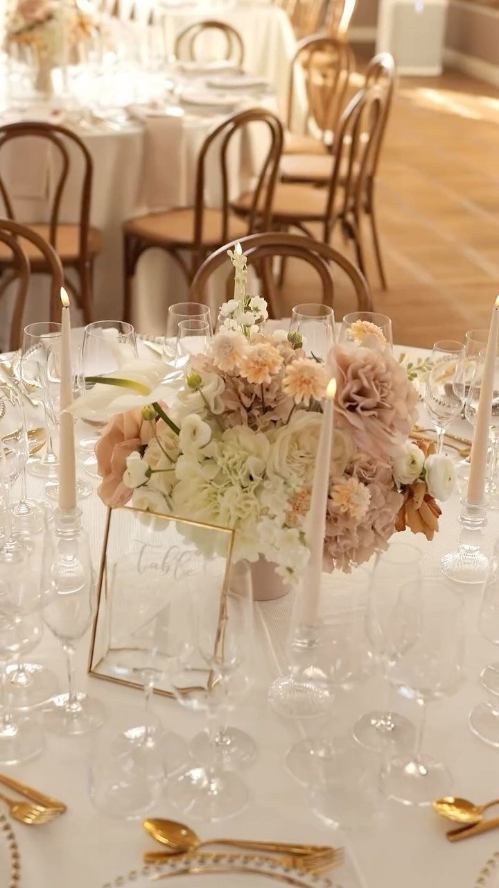
Latte chairs with white linens and gold flatware add texture without strong color, and the whole setup reads cohesive when the florals stay in cream, blush, or taupe.
Gold accents keep it from reading too flat, and the neutrals layer easily with most venue finishes.
22. Blue Grey Sea Glass
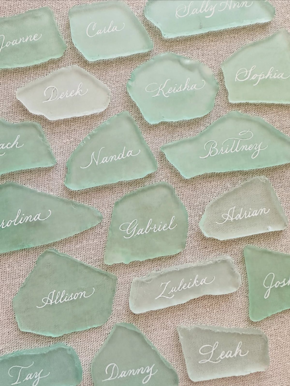
Sea glass in blue-grey tones works as place cards when you write guests’ names directly on the pieces. The color varies naturally, which gives you texture without adding pattern, and each piece sits flat on a plate or table.
This suits coastal or outdoor receptions where you want natural materials. Pair it with white, cream, or soft grey linens so the glass reads as an accent rather than a full palette.
Collect glass in one size range so the pieces look intentional together.
23. Tropical Reception Colors
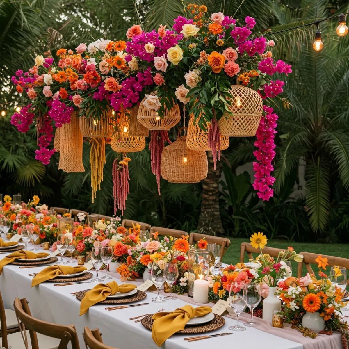
Bright pink, orange, and yellow bring you a tropical palette that reads bold and warm.
An overhead installation fills vertical space and keeps the tables simpler, which helps if your budget or timeline limits how much you can style each surface.
Pair it with white or natural wood furniture so the florals stay the focus.
Gold or brass accents tie the warm tones together.
24. Emerald and Magenta
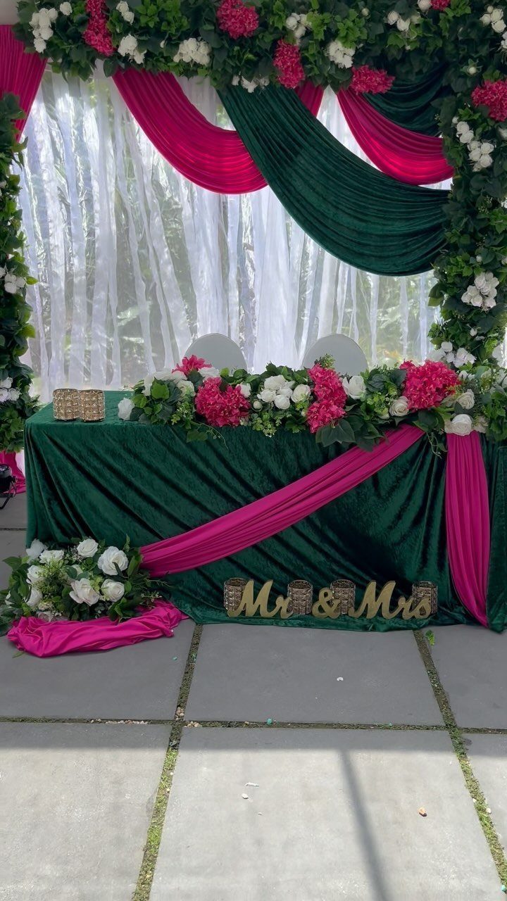
Emerald velvet and magenta fabric draped together give you high contrast and richness, and the look suits formal receptions where you want bold color without pastels.
Pink and white florals soften the palette without diluting the impact, and a gold sign or gold accents keep the whole setup from reading too heavy.
25. Yellow and Green
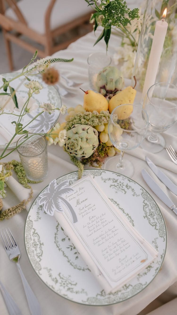
Green-rimmed plates paired with yellow pears and green grapes give you a centerpiece that doubles as something guests can eat during cocktails or toward the end of the night.
The color stays in the fruit and the plate detail, which keeps the setup simple without adding florals to every table.
This works best when the fruit is fresh and ripe the day of.
Pair it with white or cream linens so the green and yellow read clearly. Foliage fills in around the fruit without adding more color, and the whole setup suits garden or outdoor venues where natural tones already anchor the space.
26. Cream and Gold
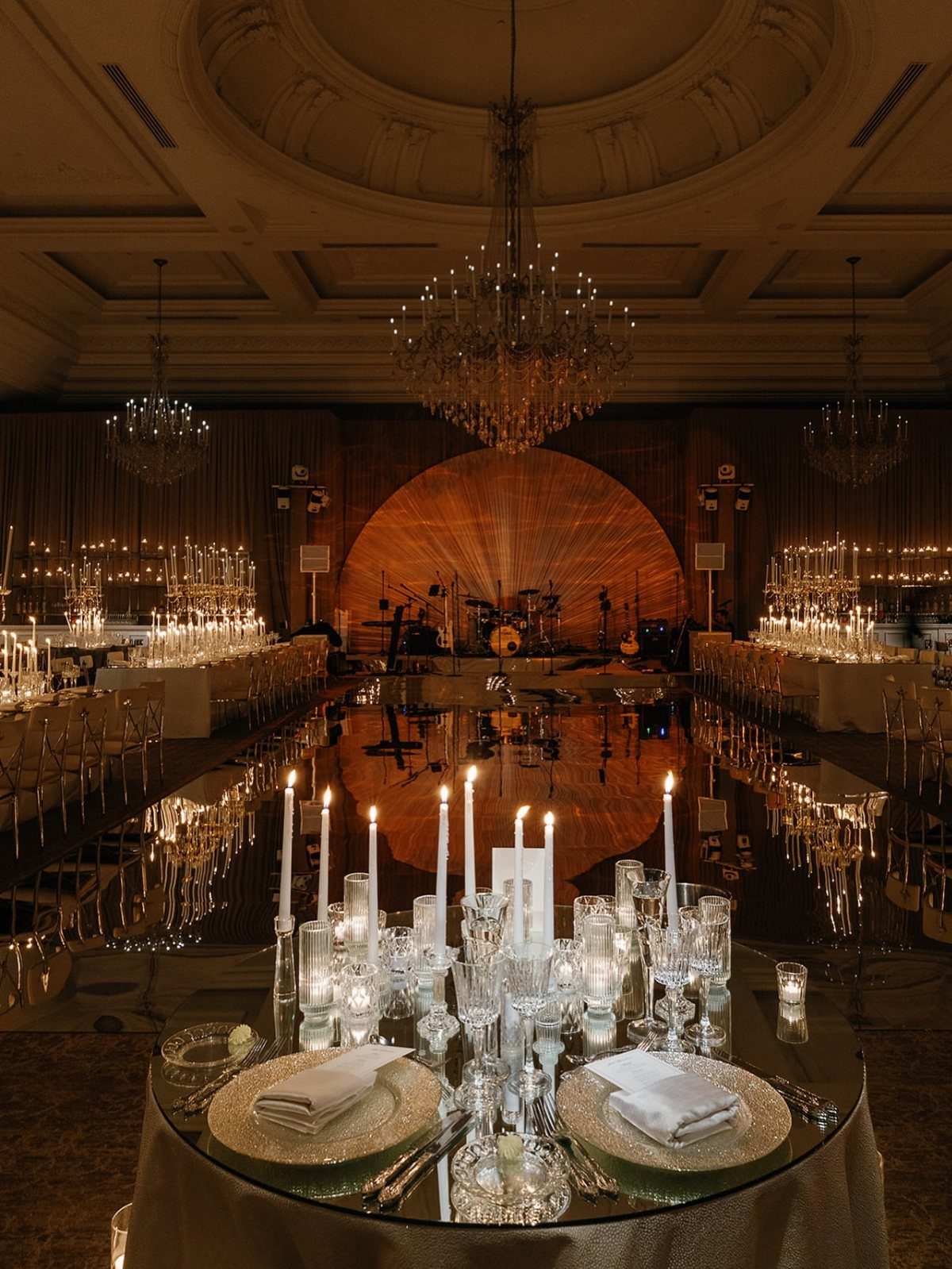
Cream linens with gold plates and chargers give you a formal palette that stays warm without introducing strong color. White candles in varying heights add light and fill vertical space, and crystal glassware or chandeliers reflect candlelight across the tables.
It reads best in a space with some vertical height, where gold accents catch light rather than disappear into low ceilings.
Gold flatware and napkin rings carry the gold through without overwhelming the table. If your venue has mirrors or polished floors, the candles and crystal add depth to the reflection.
27. Blue and White Florals
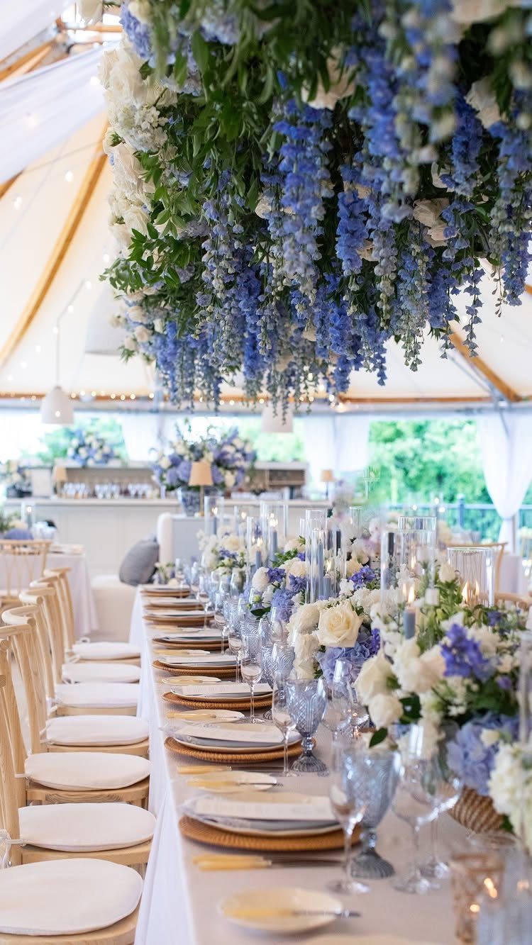
Blue and white florals in both centerpieces and an overhead installation give you layered color without adding it to the linens.
The installation fills vertical space in a tent or high-ceilinged venue, and white linens with gold chargers keep the tables formal underneath.
This palette suits tented receptions or spaces where you can anchor overhead decor securely.
The blue reads clearly against white fabric or sky, and gold accents warm the whole setup. If your florist quotes separate labor for overhead work, factor that into the budget early.
28. Green and White Decor
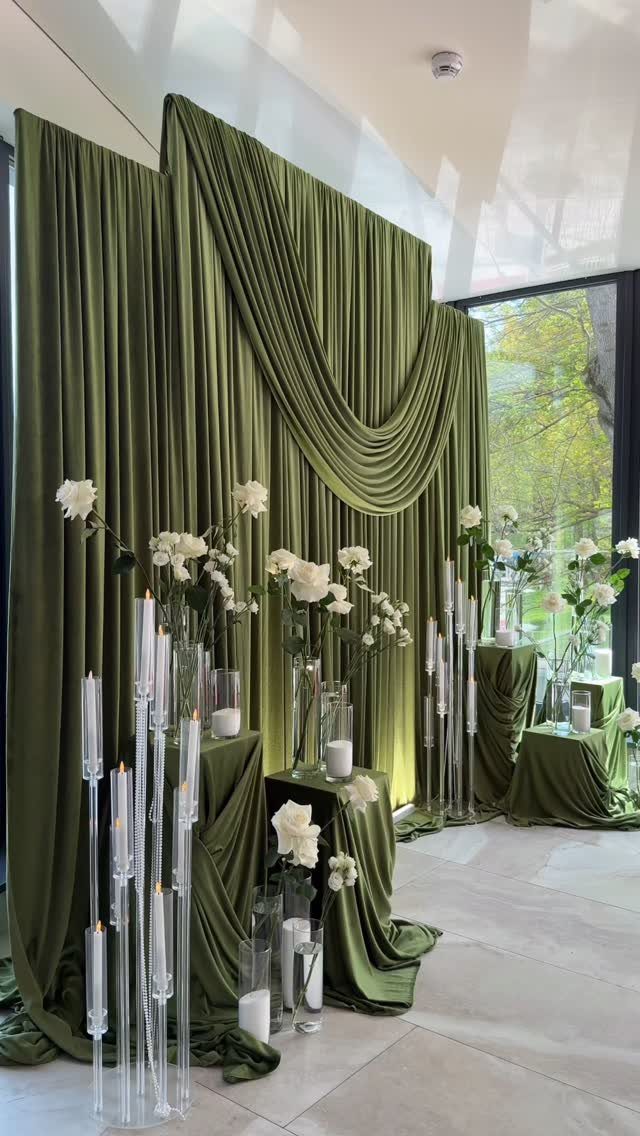
Olive green fabric draped as a backdrop with white roses and tall candles in glass holders gives you a moody, textured setup without covering every surface in green.
The green stays in the fabric, and the white florals and candles keep the whole thing from reading too dark.
Pick this when you want a bold look but jewel tones feel too saturated for the room.
Pair it with dark green napkins or table runners so the palette carries through. White-walled venues take green fabric well; it pulls focus without fighting the backdrop.
29. Red Rose Reception
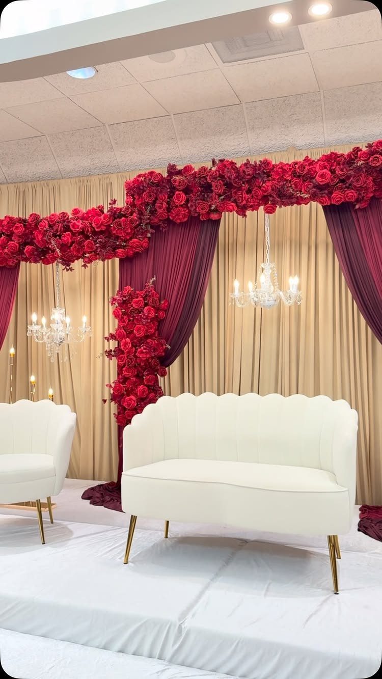
Deep red roses in garlands and arrangements paired with red curtains give you a bold, romantic palette that works in formal spaces where you want drama.
White or cream furniture and linens balance the red so it reads as intentional rather than overwhelming.
Red roses photograph richly in low light, and the color stays visible even in ballrooms with dim chandeliers.
Pair it with gold or crystal accents to lift the setup. Neutral finishes let red carry the room without color clash.
30. Purple and Blue Opulence
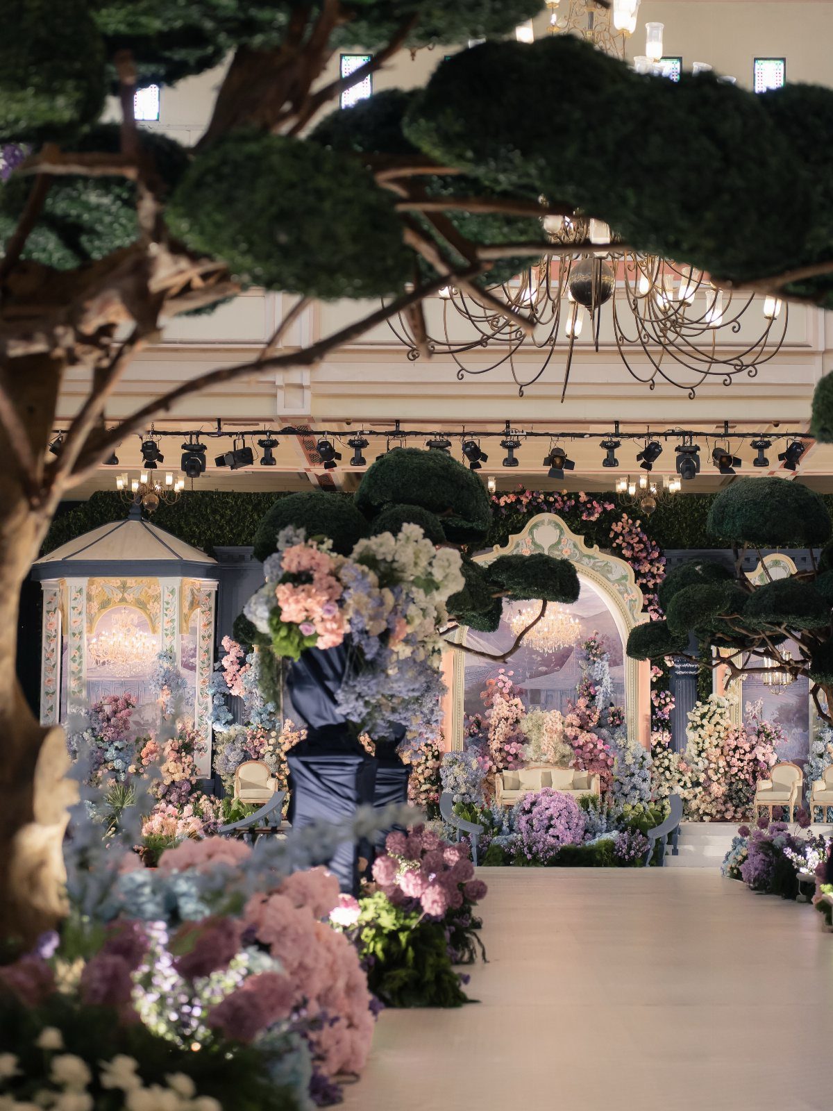
Purple and blue florals in large arrangements with gold arches and ornate details suit receptions where you want opulence and are working with a budget that allows for volume.
The color stays concentrated in the florals, and the gold frames them without adding more hues.
Large installations need ceiling height to land; in a low room they crowd, in a ballroom they fill the sight line correctly.
Green topiaries or foliage ground the purple and blue so the whole setup does not tilt too bright. If your venue has chandeliers or existing gold details, this palette ties into them.
31. Terracotta and Amber
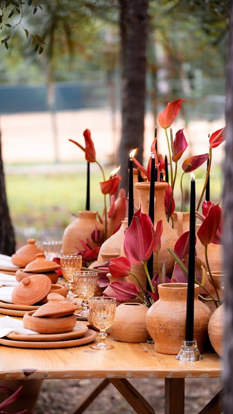
Terracotta pots as vases with amber glassware and black taper candles give you warm neutrals and dark accents on wood tables. Red anthurium or similar bold florals add color without pastels, and the black candles keep the palette grounded.
Terracotta holds florals securely and reads textured without adding pattern. Amber glass catches light during golden hour, and black candles photograph well in daylight without disappearing.
32. Beige and Terracotta
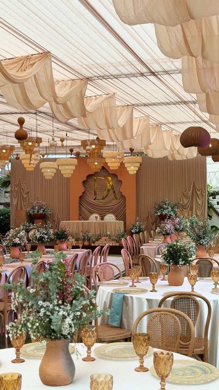
Beige fabric draped overhead or as a backdrop with wicker chairs and terracotta vases gives you a neutral palette with texture. Gold-rimmed glassware adds a formal touch, and the beige keeps the whole setup soft without reading too plain.
The beige fabric fills vertical space and balances the terracotta without adding more color to the tables.
Keep florals in cream, rust, or soft orange so the palette stays cohesive.
33. Navy and White Welcome
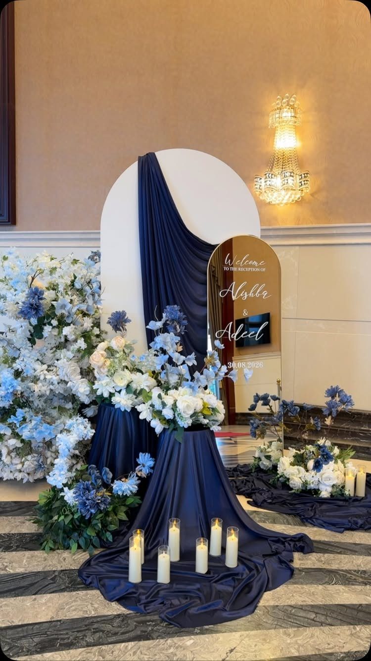
A circular white backdrop with navy draping frames a welcome area at the entrance, and white and light blue florals with candles style the surface below. A mirror sign holds guest names or a welcome message.
The circular backdrop gives you a focal point that photographs cleanly, and the navy draping adds depth without overwhelming a small entry space.
Gold accents or gold lettering on the mirror tie into warm lighting. If your venue entry is narrow, the circular shape keeps the setup from blocking the flow.
Choose Colors Around the Venue
Look at your venue before you finalize the palette. Whatever’s already there, brick or carpet or linen drapes, sets the baseline for how any color you bring in will look.
When the room itself has a strong palette, I pick colors that sit next to those tones instead of fighting them. A neutral base with 1 or 2 saturated accents keeps the setup from competing with what is already there.
If the space is already busy, I lean on material and form to add interest without piling on more hues. That means linens with subtle pattern, varied heights in centerpieces, or different finishes on metals and glassware.
If the space leans warm, cool accents can feel disconnected. If it leans cool, warm tones need careful placement to avoid looking out of place.
Coordinate Colors Across Details
A palette carries through flowers, attire, linens, invitations, decor, food, drinks, lighting, and signage.
Colors do not need to match exactly across every surface. You can shift the ratios between spaces or use one tone as an accent in the ceremony and a dominant color at the reception.
Warm tones like orange and pink work as accents in a hand-crafted theme, and they pair with cream, blush, or gold for energy without overwhelming the setup.
Change the mood from ceremony to reception by adjusting which color leads. If your ceremony palette is soft and neutral, bring in a brighter or richer version of one accent color at the reception.
Balance and Test Color Choices
Pick 3 to 5 colors and include at least 1 timeless neutral. Another approach suggests a 60-30-10 ratio: 60% for the dominant color, 30% for a secondary, and 10% for an accent.
Test print samples before you commit. Paper stock and print finishes change how colors appear.
A matte finish pulls color toward calm and contemporary, while a linen or laid texture brings body and a softer feel. Gloss or foil accents intensify contrast and make metallic or darker shades feel more luxurious.
Lighting at your venue affects how colors photograph and how they read in person, so bring swatches or samples into the space at the same time of day your reception will run.
Frequently Asked Questions
What are the trendy colors for weddings in 2026?
Sage green, dusty blue, champagne, terracotta, burnt orange, and lavender show up frequently in current reception palettes.
These colors suit a range of venues and seasons, and they photograph well in both natural and low light. Neutrals like champagne and latte anchor palettes that rely on texture rather than strong color contrast.
What are the best color combinations for a wedding?
Dusty blue with blush and ivory, sage with champagne and cream, and burgundy with gold and ivory all balance warmth and contrast without overwhelming a space.
Each combination works across formal and casual venues, and the neutrals keep the palette cohesive when the bolder shades show up in florals or linens. Pick combinations where one color anchors and the others support it.
What are the most popular wedding colors right now?
Dusty blue, blush, sage, champagne, burgundy, terracotta, mocha and taupe show up most often in current reception plans, holding steady across spring, summer and fall.
These colors layer easily with white or cream and suit both indoor and outdoor venues. Gold accents tie warm palettes together, while silver keeps cooler tones polished.
How to choose your wedding colors?
Start with your venue, season, and the mood you want people to feel when they walk in.
Garden settings call for softer greens and pale blues; formal ballroom floors carry deeper color and metallics better. Choose colors you genuinely like rather than following a trend, and test how they look together in the space before committing.
Do all my colors need to match perfectly from ceremony to reception?
Colors can shift in ratio or intensity between the ceremony and reception without losing coherence. Use accents and transitions rather than making every detail the same shade, and let one or two colors carry through while others change.
Reusing ceremony florals at reception tables or moving the ceremony arch to the sweetheart table creates flow without exact duplication.
What are some creative ways to incorporate my colors into the food and drink?
A signature cocktail, tinted glassware, colored salts for margaritas, or edible flowers in champagne all bring your palette into the bar and dessert table.
Ribbon on the cake or metallic accents on dessert plates carry the color without altering the menu itself. Garnishes and drink presentation work when the food itself stays neutral.
How can lighting help extend my color palette?
Soft, neutral light at the ceremony can shift to candlelight or colored uplighting at the reception, which changes the mood without changing the decor.
Lighting transforms how your colors read as the day moves into evening. Candles and dim lighting warm champagne and blush tones, while uplighting can intensify jewel tones or add drama to a neutral setup.
How can I make my florals work for both the ceremony and reception?
Plan to move aisle arrangements to reception tables or reposition the ceremony arch at the sweetheart table so the same florals serve both spaces.
Reusable floral setups keep your color consistent and make the most of your budget. Talk to your florist early so the ceremony arrangements move to the reception without looking like an afterthought.
My venue has strong existing colors. How should I choose my palette?
Identify the undertones in your venue’s walls, floors, or carpeting and choose colors that complement rather than compete with them.
A neutral base with one or two saturated accents works well in visually busy spaces where bold venue finishes already set the tone.