Wedding party colors run from bright citrus and cerulean to deep burgundy and sage green, with each palette asking something different of your venue’s light and your party’s size.
The deciding factor is not the season alone but whether your location amplifies or fights the tone you choose.
A sage green that reads clean under skylights turns muddy under yellow bulbs, and an ombre scheme needs enough bridesmaids to read as intentional rather than accidental.
1. Seasonal Colors
Spring weddings call for butter yellow, pale lavender, and dusty blue, the kind of tones that feel at home beside blooming gardens. Summer opens the door to coral, peach, and mint green, colors that hold their own in bright sunlight.
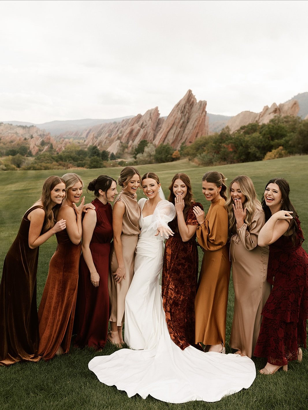
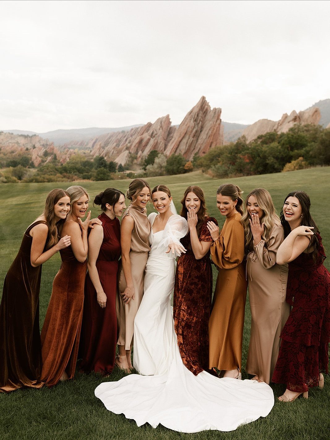
Fall brings terracotta, burnt orange, burgundy, and deep olive, shades that pick up what the trees are already doing.
Winter weddings work best with emerald, navy, ice blue, silver, and deep berry, colors that catch candlelight or stand out against snow.
The season sets the starting point, but your venue changes the answer. An indoor winter ballroom in Florida needs a lighter hand than a January ceremony in Minnesota.
Check what your location already gives you before you commit.
2. Bright Citrus Colors
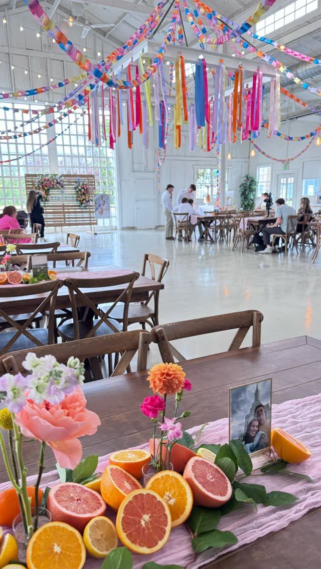
Oranges, yellows, and greens read as fresh and unforced for a summer wedding, the kind of palette that feels like it belongs outdoors in high heat.
Sliced citrus on tables brings the color into the decor itself rather than keeping it only on bodies.
The risk is looking like a juice commercial. Fall foliage, even a few branches or dried leaves, pulls the brightness back toward something grounded.
I would add that contrast for any wedding after mid-August, and skip it only for a June ceremony on the coast where the whole idea is relentless sunniness.
3. Cerulean with Pink
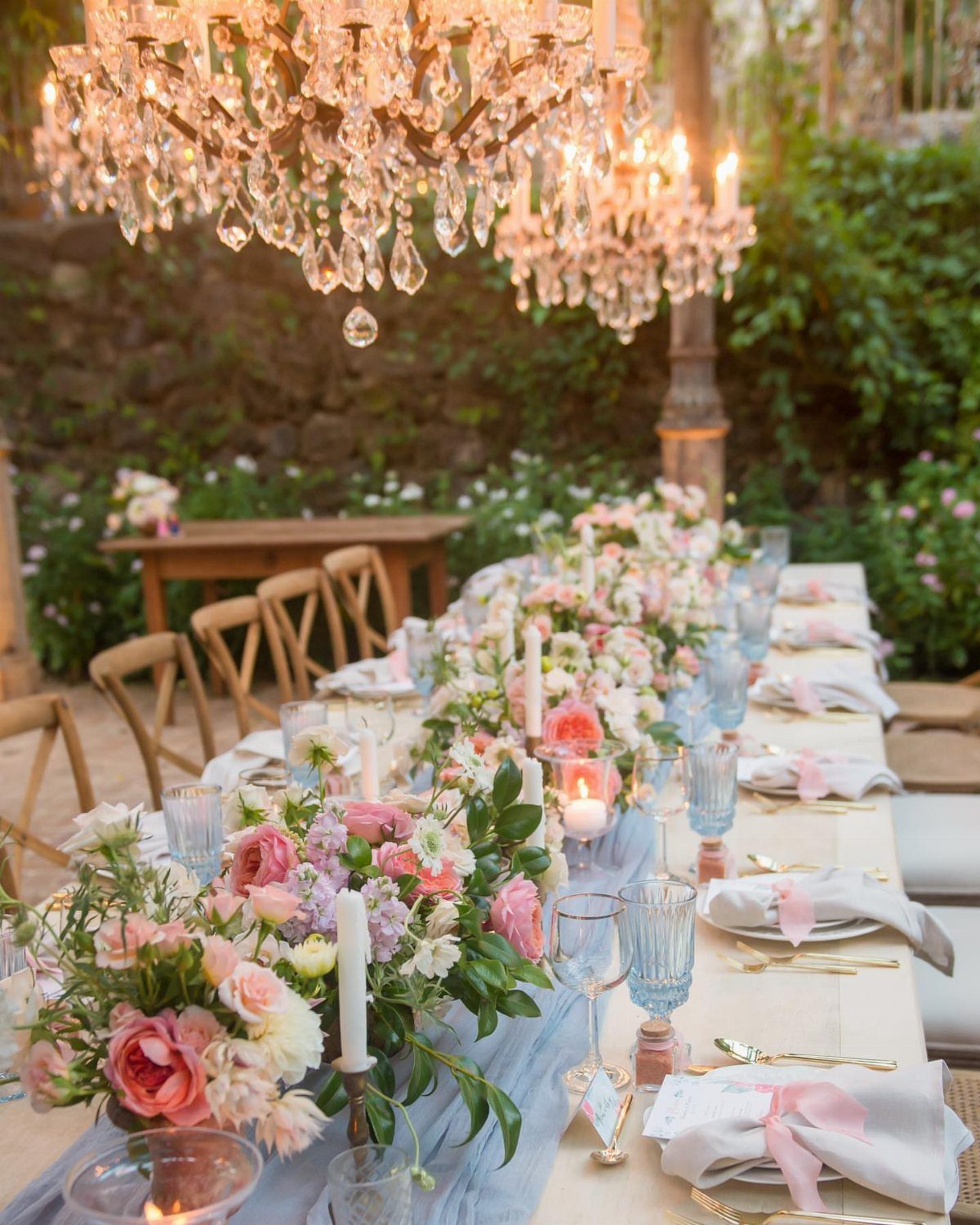
Cerulean and pink together read as playful, not weighty, which is why they work for fall without feeling like summer leftovers. The blue carries enough depth for shorter days, and the pink keeps it from turning cold.
I would build this palette by starting with the cerulean as the anchor, your runners or the groomsmen’s ties, then bringing in pink through flowers and glassware.
Add a third warm color, maybe amber or soft coral, anywhere the two main colors meet. Without that bridge, the pairing can feel like two ideas that happened to show up in the same room.
4. Ombre Color Scheme
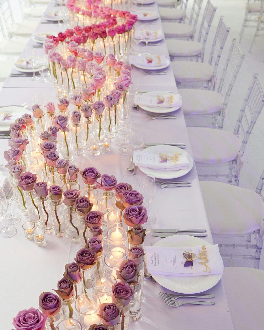
An ombre scheme gives each bridesmaid her own shade within one color family, which solves the matching problem without abandoning cohesion.
The dresses need to stay in the same fabric and length, or the color shift looks accidental. I would line the bridesmaids up from lightest to darkest for photos and let them choose their own placement in the ceremony otherwise.
One caution: ombre needs enough people in the party to read as intentional, not accidental. With 2 bridesmaids, you simply have two different dresses.
5. Rainbow Bridesmaid Dresses
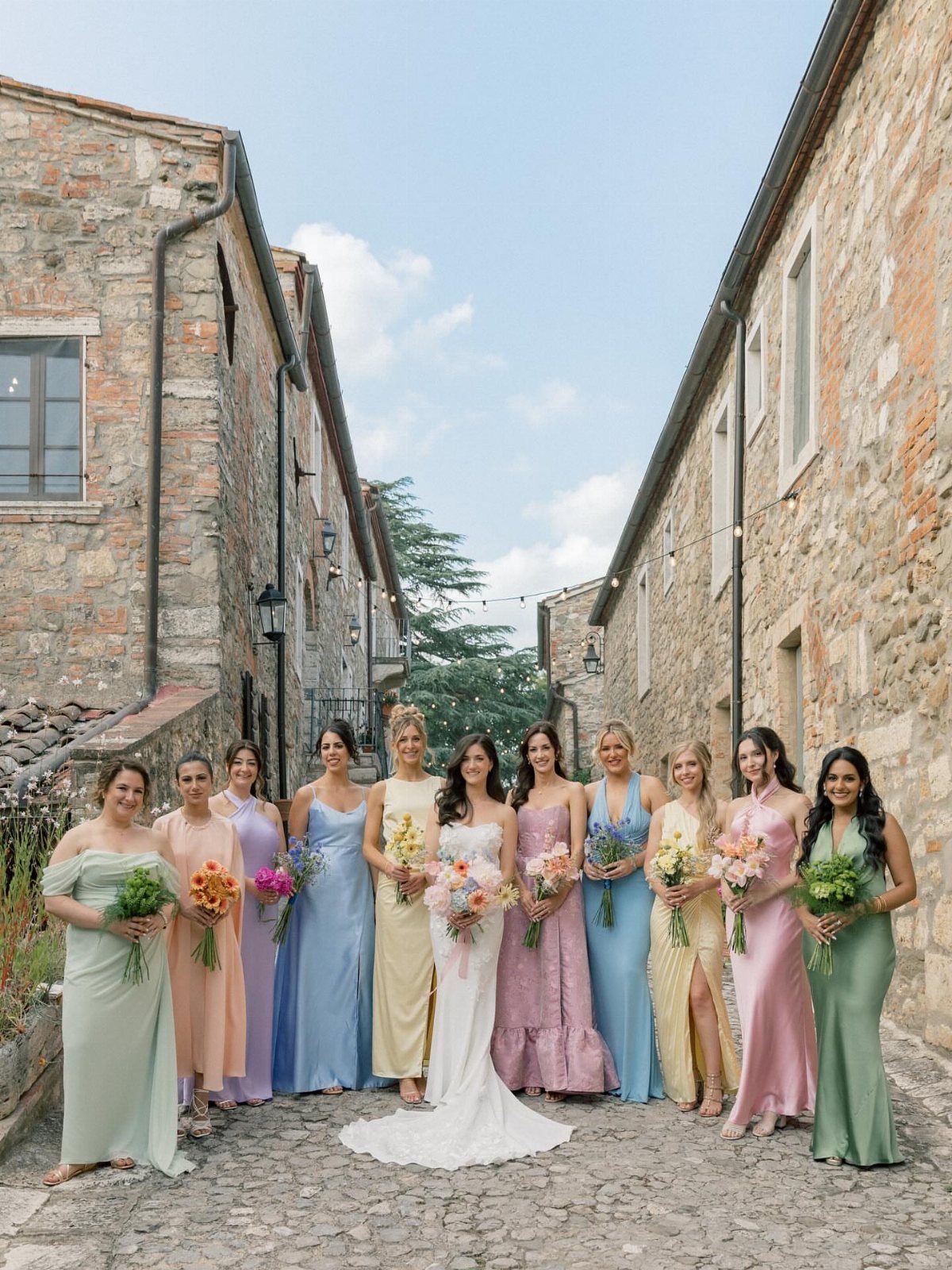
Bridesmaids in mint, peach, lavender, blue, yellow, pink, and sage turn the wedding party itself into the color story.
Each woman gets a hue that suits her, and the group reads as joyful rather than chaotic because the tones stay pastel and muted.
The bouquets need to tie the look together. I would give every bridesmaid the same mixed arrangement, pulling from all the dress colors, so the eye travels across the group and finds repetition.
Without that, the effect can look like everyone dressed from different weddings. This suits a couple who wants photos that feel celebratory rather than formal, and who has enough bridesmaids that the spectrum fills out.
Pick the exact same dress in the different colors of your wedding color palette, to give your bridal party a pop of color. For a truly eclectic look choose the same dress in a variety of patterns.
6. Light Blue Attire
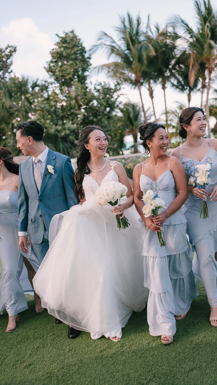
Light blue on both the groomsmen and bridesmaids creates a washed, coastal feeling that works for outdoor ceremonies in warm months.
The groom’s suit in the same tone as the bridesmaids’ dresses, rather than navy or black, keeps the wedding party reading as one unit rather than two separate teams.
I would watch the fabric weights. A light blue linen suit for August in Florida makes sense; the same color in wool for a church in October looks like a season missed its cue.
Check that the bridesmaids’ dresses and the men’s suits can be sourced from different brands in close enough shades, or the coordination becomes a single-vendor trap that drives up cost.
7. Pastel South Asian Ensembles
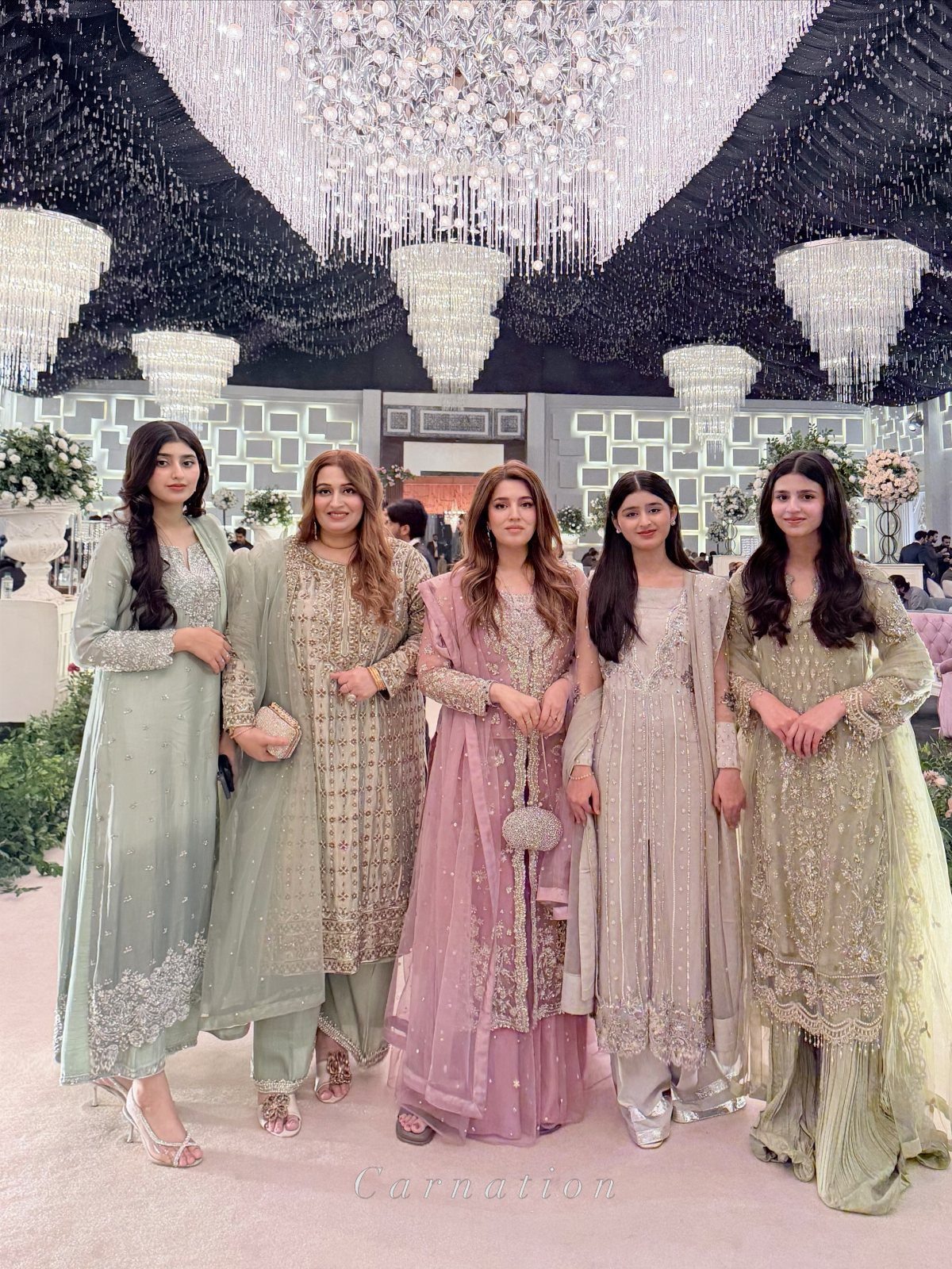
Pastel South Asian ensembles in sage green, pale gold, and dusty rose let a bridal party carry embroidery and sequins without the color saturation of a full jewel-toned palette.
The chiffon and net layers catch light under chandeliers in a way that reads formal without reading heavy.
This works when the wedding itself mixes Western and South Asian elements, or when the couple wants the bridal party to nod to heritage without full traditional dress. The muted tones keep 5 women from competing with each other in photos.
Check whether your venue’s lighting warms or cools those pastels. Sage green shifts muddy under yellow bulbs; dusty rose flattens in fluorescent light.
Ask your photographer about white balance before you commit.
8. Monochrome Mint Green
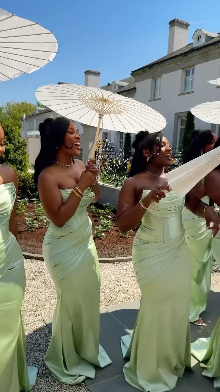
Mint green satin reads spring or summer without trying to shout. Strapless cuts and matching parasols give the color its structure; without that coordination, mint can look like a prom leftover.
Parasols are a specific choice. Parasols add a small per-person cost if you buy, or a morning of DIY if you cover plain ones in paper or fabric.
The white against mint photographs clean, but any other parasol color splits the focus. I’d keep them white or skip them.
This suits a daytime outdoor wedding where the light is bright enough to make satin glow rather than glare. Indoors or at dusk, the same dresses turn flat and slightly institutional.
For a manor or garden setting with stone or greenery behind them, the color holds its own.
9. Muted Taupe Lace
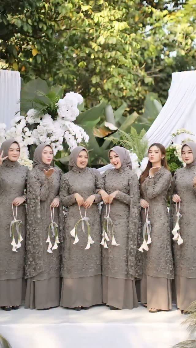
Taupe lace on long sleeves and floor-length cuts solves a problem I see often: a bridal party that needs coverage for religious or family reasons, but doesn’t want the visual weight of a dark color.
The lace keeps the fabric from reading as heavy, and the muted olive undertone shifts with the light rather than fighting it.
Four of the 6 women wear matching hijabs in the same lace. If your party includes women who cover, ordering extra fabric from the dress run lets you cut matching pieces rather than hunting a close-enough shade later.
Ask your vendor about this upfront; lace dye lots vary enough that a second order rarely matches.
The small white bouquets against the backdrop of white flowers and greenery keep the palette from turning muddy. Without that contrast, taupe on taupe disappears.
10. Deep Burgundy Attire
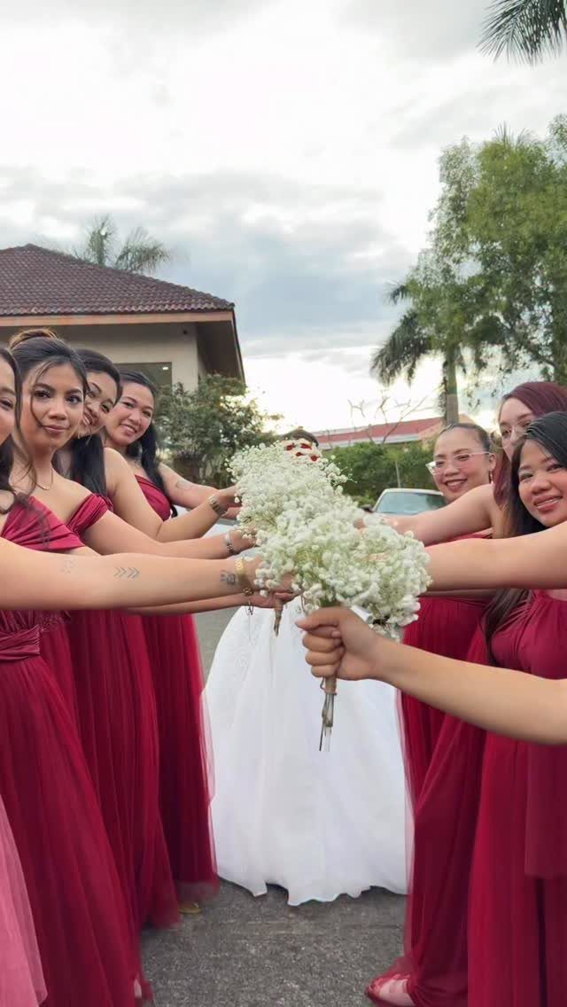
Deep burgundy carries a fall wedding without defaulting to the expected orange-brown palette. The richness holds up outdoors under cloudy skies, where brighter reds turn harsh and cheap.
Left scattered, it can read as too heavy against a white gown. Grouped, it creates depth.
This color works across most skin tones, which matters if your party spans a range of complexions. The dark value flatters without the starkness of black or navy.
For a winter wedding, I’d push toward the berry end; for late September, the terracotta edge.
11. Mismatched Floral Print Dresses
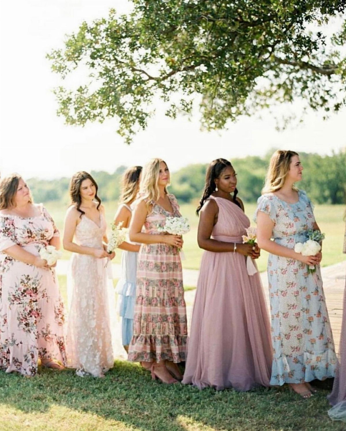
Mismatched floral prints trade uniformity for personality, and the risk is obvious: different patterns that still read as one unit. That coherence comes from the shared floor length and the soft color ceiling.
The white bouquets act as neutralizers. Without them, the eye fragments across the patterns.
With them, the flowers become the common language.
This asks more of your shoppers than a single dress choice. Each woman finds her own print, which means managing timelines, budgets, and taste conflicts.
Set the rules early: length, color family, no large background colors outside the palette. One black-based floral ruins the effect.
12. Sage Green Sarees
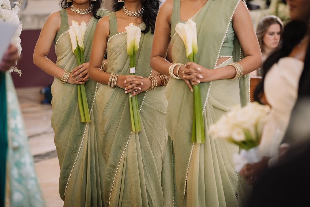
Sage green sarees with pearl trim and single calla lilies read restrained where South Asian bridal party dress often goes ornate. The gold bangles and beaded necklaces add the expected warmth without competing.
Sarees as bridesmaid dress require someone who knows how to drape, or budget for a stylist. A pearl border that is machine-finished keeps cost down; hand-beaded trim runs higher but photographs the same at guest distance.
I’d ask to see the actual fabric swatch before ordering, since sage shifts dramatically between silk, chiffon, and georgette.
The single long-stemmed calla lily replaces a full bouquet. That choice works for a small bridal party; past a certain size, the repetition starts to look sparse rather than intentional.
For a larger group, add stems or switch to a fuller flower.
13. Lavender and Silver Embroidery
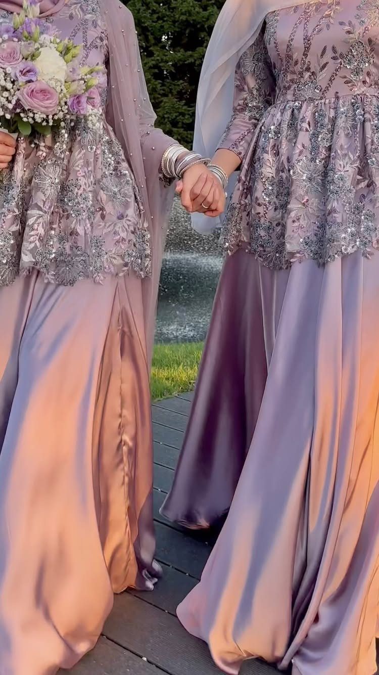
Lavender and silver embroidery reads as formal without the weight of navy or black. The satin catches evening light, and the silver threadwork keeps the eye moving so no single element feels heavy.
This pairing suits spring and summer weddings most naturally, though the silver shifts it toward winter if the fabric weight changes.
The embroidery placement matters more than density: bodice and sleeve edges photograph cleanly, while all-over pattern competes with bouquets and table settings.
This look asks more of the dress than of accessories, so put the money where it shows. Silver shoes and simple earrings finish it; a necklace fights the neckline.
The hijab matching the gown color unifies the silhouette, which helps in group photos where mixed necklines can scatter the frame.
Reserve this for weddings with some structure in the day, not the most casual backyard setup. The formality of floor-length satin needs an aisle, a seated dinner, or at least a tent with real chairs to feel at home.
Choosing Colors for Different Seasons
Spring pastels like butter yellow and pale lavender need to be checked against what is actually blooming at your venue that month. A garden heavy in red tulips will fight a lavender bridal party rather than frame it.
Summer brights hold up in direct sun but turn harsh under tenting or indoor reception lighting. Walk your venue at the hour you will be there, not just noon.
Fall foliage varies by region and by week. Maples in Vermont turn 2–3 weeks earlier than oaks in Virginia.
If you are building your palette around leaf color, check local foliage reports from the previous 2 years for your date.
Winter jewel tones catch candlelight, but only if there is candlelight to catch. A hotel ballroom with overhead fluorescents will flatten emerald to a dull green.
Navy and deep berry read almost black under dim hall lights; if the venue can’t adjust overhead fixtures, those colors lose their depth before the first dance.
Bridesmaid Dress Considerations
Chiffon, velvet, satin, and lace each change how a color reads. Chiffon softens pastels to near-transparency; velvet deepens jewel tones to near-black in shadow.
Satin adds shine that photographs lighter than the swatch appears indoors.
Order fabric swatches and view them where your wedding will be held, not just by your apartment window. The same blush turns peach under incandescent bulbs and gray under LEDs.
Skin tone matters across a diverse party. Navy, blush, and champagne are the most reliable across complexions.
If you want a bolder choice, test it on each bridesmaid in natural light before ordering.
Color Palette Inspiration
Your venue’s existing colors are the starting point, not your Pinterest board. A barn with red walls limits you whether you planned around it or not.
Visit at your ceremony time and note what colors are already present in flooring, walls, and fixed decor.
Lighting shifts color dramatically. Natural daylight at 4 PM, golden hour at 6 PM, and reception lighting after dark are 3 different palettes wearing the same dress.
Photograph your swatches at each stage if possible.
Mix-and-match works in 2 directions: identical color with varied necklines, or varied shades with identical cuts. Do not try both at once; the eye needs one anchor to read coordination.
Mixing Styles and Colors
Mismatched colors need shared undertones to read as intentional. Cool blues with cool pinks, warm corals with warm peaches.
One orange-toned dress in a group of blue-toned ones looks like a mistake, not a choice.
Assign colors by role if you want structure: maid of honor in the lightest shade, bridesmaids stepping darker, or the reverse.
When the shades don’t match exactly, grouping by color for photos keeps the wedding party looking intentional, and letting each person pick their own seat at the ceremony keeps it relaxed.
Shared fabric weight matters as much as shared color family. Chiffon beside velvet reads as 2 different events even in the same hue.
Set the material rule when you set the palette.
Frequently Asked Questions
What are the best colors for a bridal party?
The colors that work are the ones that suit your venue’s existing tones and photograph cleanly against your backdrop. I would order fabric swatches before committing, since lighting at different times of day changes how a color reads.
Navy, blush, and champagne tend to flatter a range of skin tones without fighting the white of the wedding dress.
What are the trendy colors for weddings in 2026?
Spring weddings lean toward butter yellow, pale lavender, and dusty blue. Summer palettes have shifted toward coral, peach, and mint green in the 2026 collections I’ve been tracking.
Winter suits emerald, navy, ice blue, silver, and deep berry, colors that catch candlelight or stand out against snow.
What colors are frowned upon at weddings?
White is the one to avoid in a bridal party, since it competes with the bride. Black can read as too heavy or funereal unless the wedding itself carries that formality.
Beyond those two, the question is less about forbidden colors and more about whether the tone fits the season and the venue.